Villa Sanquirico
RISING STAR
Rethinking a historically significant venue for the city, open to art and nightlife. The new visual identity of Villa Sanquirico is a project by Bellissimo.
It’s no secret: Turin is a city of layers, where historic architecture and new impulses coexist in search of a shared language. Within this balance, Villa Sanquirico seeks to establish its presence within the city’s events and nightlife scene. A space to be reinterpreted, where Art Nouveau style meets new forms of expression.
Bellissimo signs the visual identity project with the intent of transforming architecture from a container to a living language — made of details, ornamentation, rhythm. The starting point were the villa’s shapes, observed, deconstructed, and reassembled into a design system.
The custom typeface is derived from the proportions of the villa and extends its language into the graphic space.

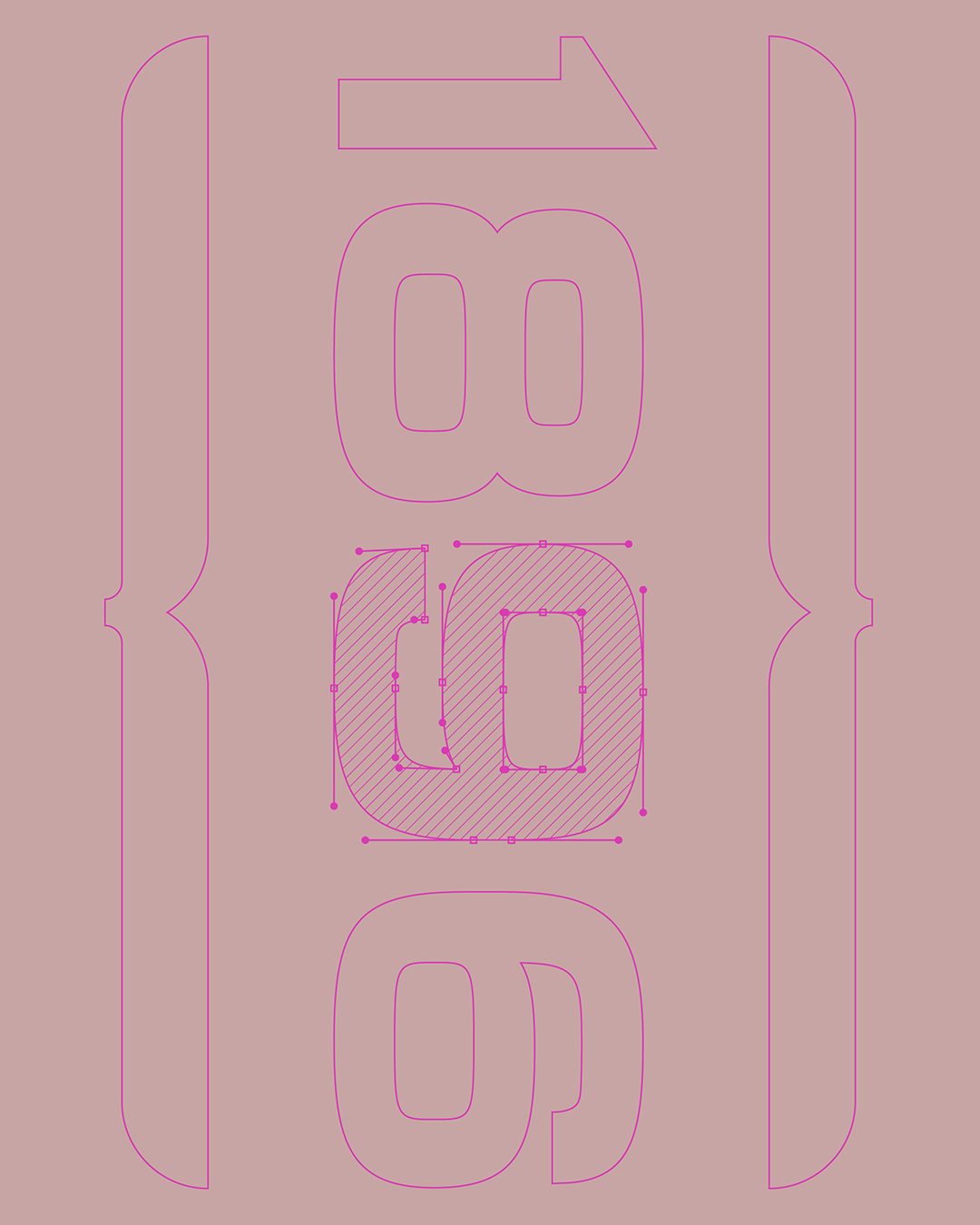
The first output is a custom typeface, built on the original proportions of the building. Around the logotype, a complete identity system unfolds, where each element derives from the same generative principle.
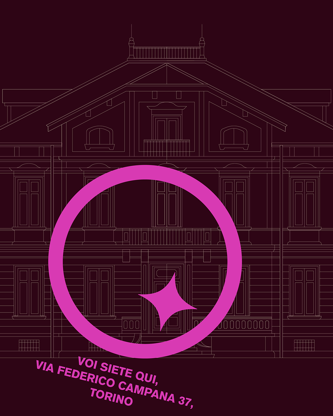
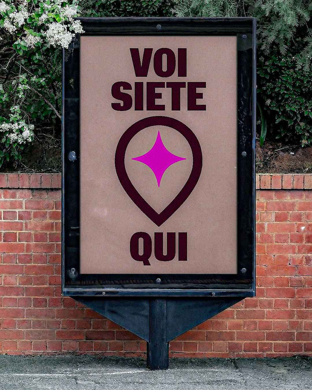
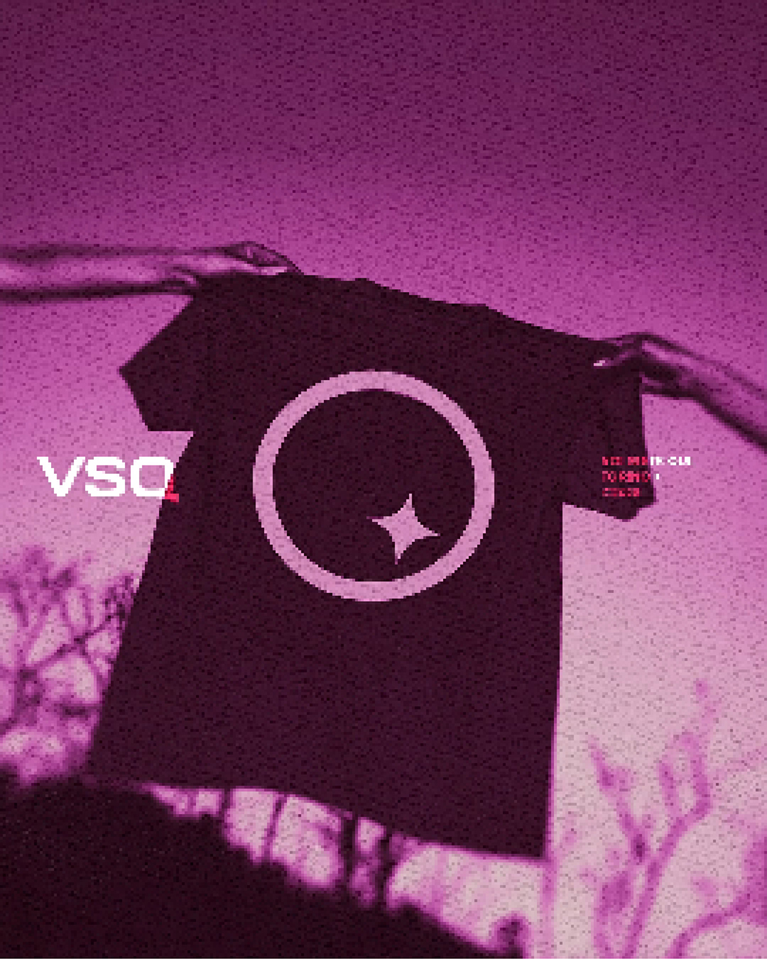
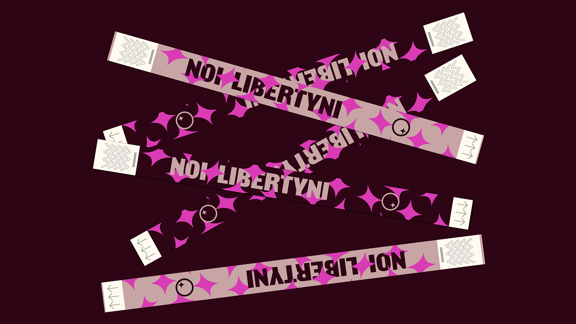
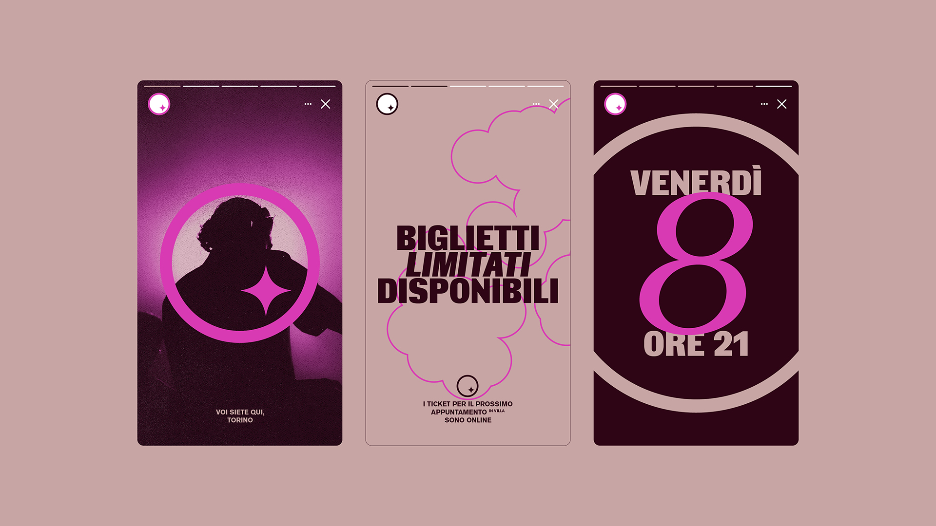
The brand introduces a theme of orientation and localization: a circle frames the symbol of a star locating Villa Sanquirico within the city — and within a new cultural geography. From here, the acronym VSQ becomes a message: Voi Siete Qui(You Are Here). A straightforward invitation to step into the villa’s spaces and experience them.
The villa’s ornamental details become a system of contemporary signs.
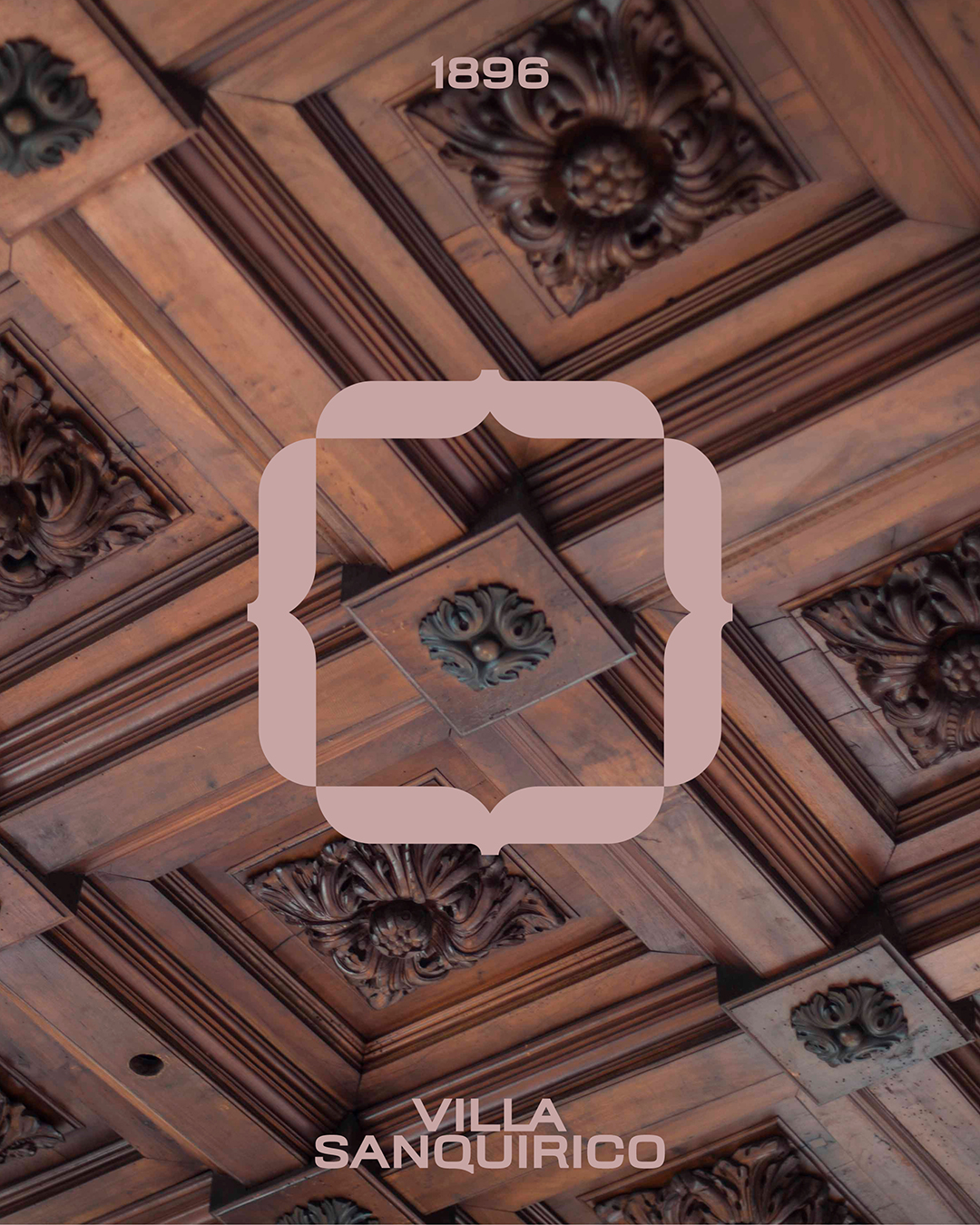
The color palette starts from the powder tones of the interiors and expands into deeper shades, designed for the world of events.

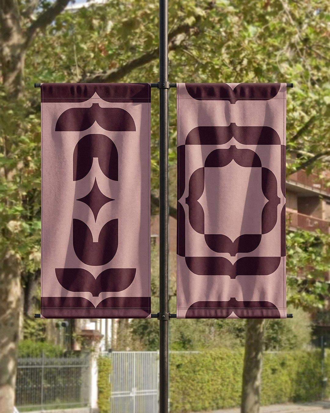
The visual language expands into a system of icons that reinterprets decorative motifs in a contemporary key, where flowing lines maintain a balance between the heritage of the eclectic style and new expressive possibilities. The result is an identity that frames Villa Sanquirico as a historically rooted entertainment venue looking forward — open to experimentation, nightlife, and artistic expression, reinterpreted through a contemporary sensibility.
The star in the symbol brings together position and identity, locating and defining a place within the city.
For Bellissimo, it is also a return to the early clubbing scene, from Explosiva to the Azimut logo, as well as to a way of designing identities in which memory and design thinking meet to shape new languages.
YOU MAY ALSO LIKE
-
MaaS for Italy: activities and results at a glance. The white paper designed by Bellissimo for the Italian Government
MaaS for Italy is Italy’s first large-scale pilot of the Mobility as a Service model. Funded with €56.9 million, the program involved six major cities and seven territories, encouraging local (...)
Read -
New languages for evolving institutions. A conversation with Massimiliano Cipolletta, President of the Torino Chamber of Commerce
Nearly a year after the rebrand, Bellissimmo’s project for the Torino Chamber of Commerce has been rolled out consistently across the territory — an opportunity now to reflect on the value of (...)
Read -
Packaging on display. At the ADI Design Museum, the three Boxes for inspirational design created by Bellissimo for Bombay Sapphire
From March 4 to March 26, 2026, the ADI Design Museum in Milan hosts the exhibition Design di Filiera. La Filiera del Packaging, curated by Carlo Branzaglia and Wladimiro Bendandi and promoted by (...)
Read -
Why teach entrepreneurship: an interview with Giancarlo Rocchietti and Barbara Graffino from Enter Academy
It can’t really be labelled as a school, but it’s more than just a training program. Enter Academy is a non-profit foundation that aims to inspire the next generation of entrepreneurs. Supported (...)
Read