La Venaria Reale
NATURAL EVOLUTION
Refreshing the communication of a site with 1 million annual visitors: visuals, tools, campaigns. A narrative that opens the doors to a magnificent palace.
The collaboration with the Consorzio delle Residenze Reali Sabaude was intense. The goal: to renew the entire visual communication —logo aside— within just a few months, in a period of changes accelerated by the pandemic. The strategy for Venaria Reale focused on positioning it as a full-fledged cultural hub — not just a monumental complex, but a space for experiences of art, beauty, and nature.
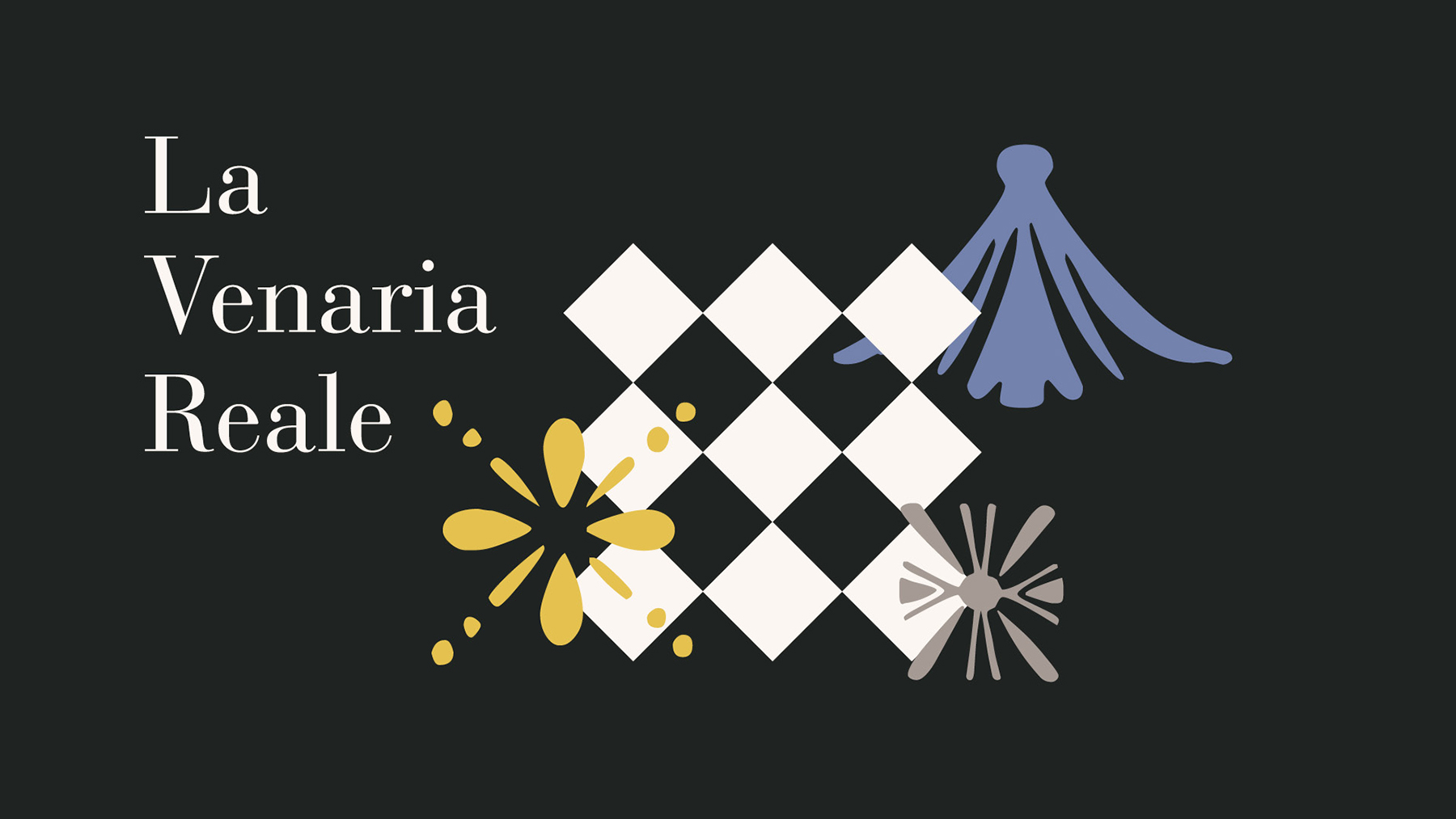
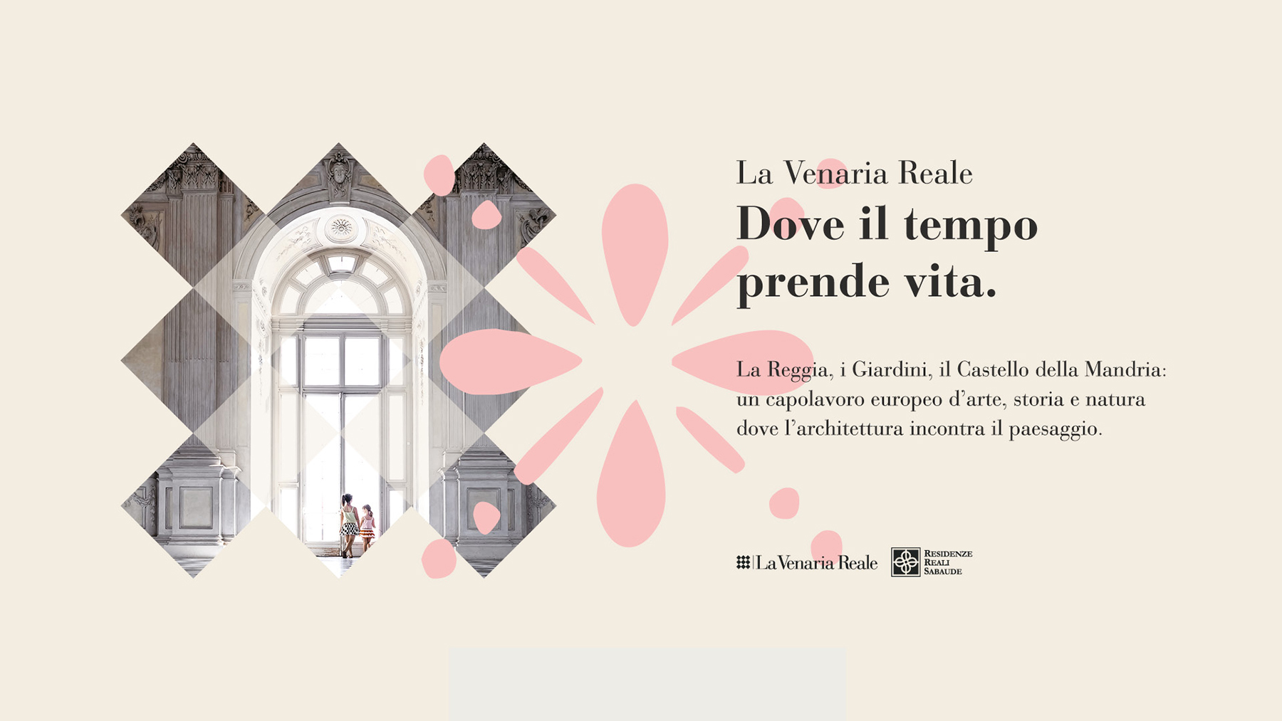
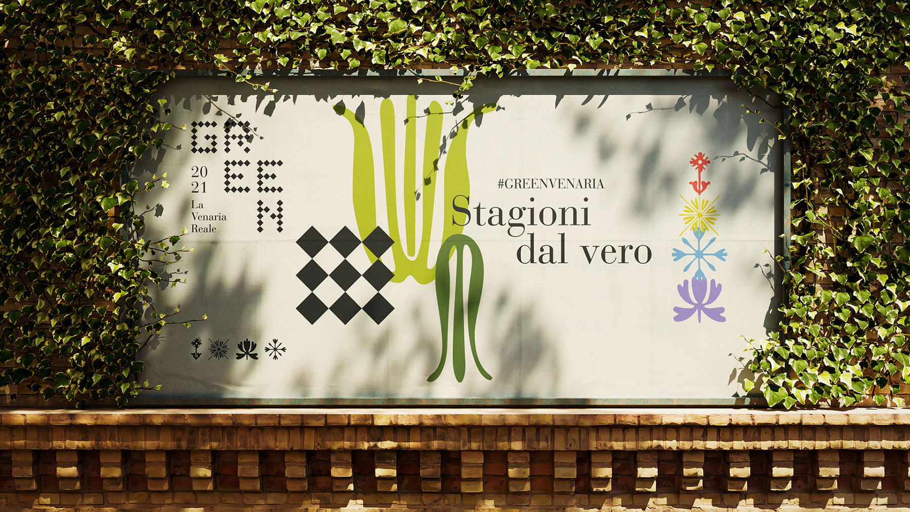
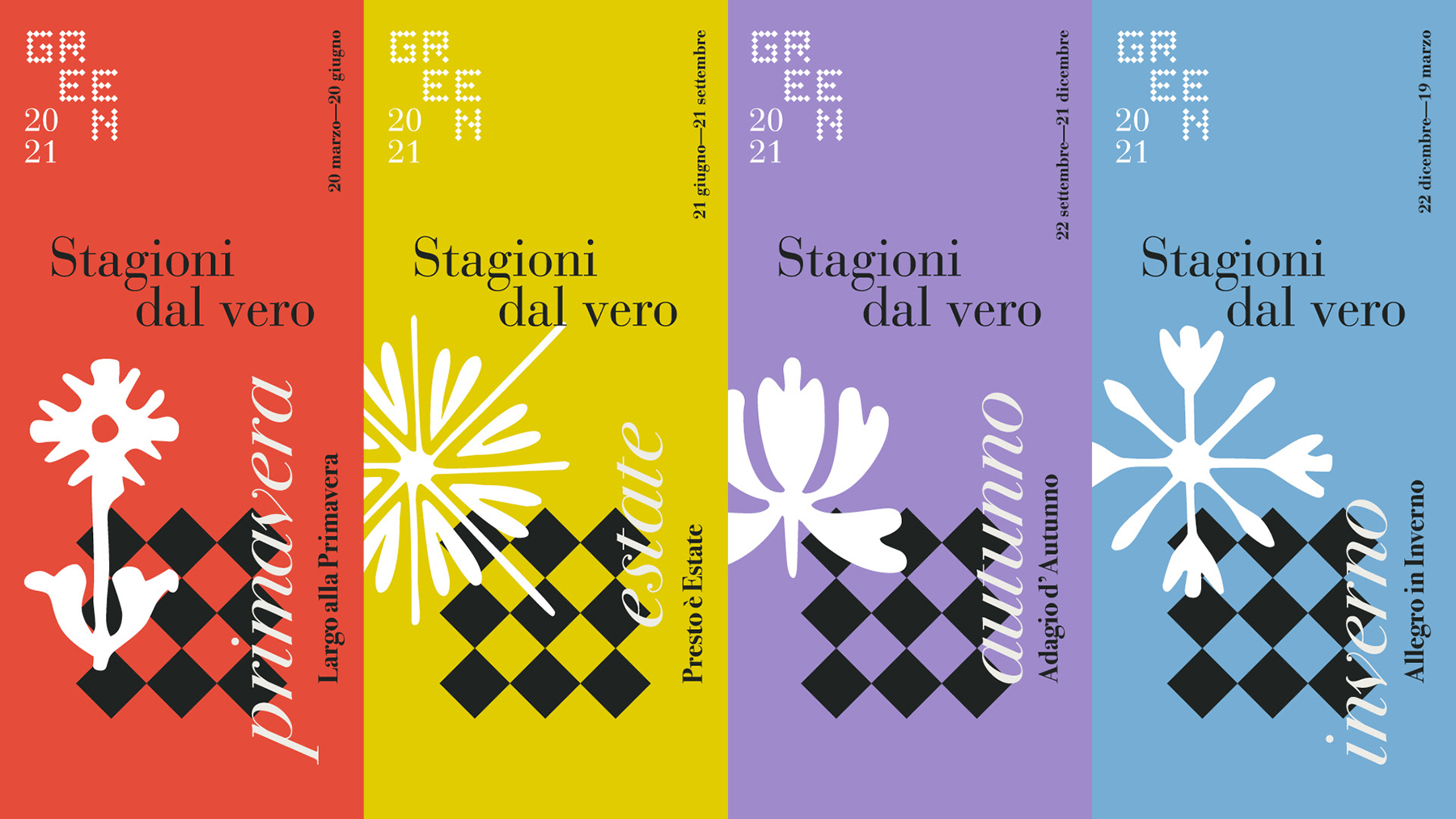
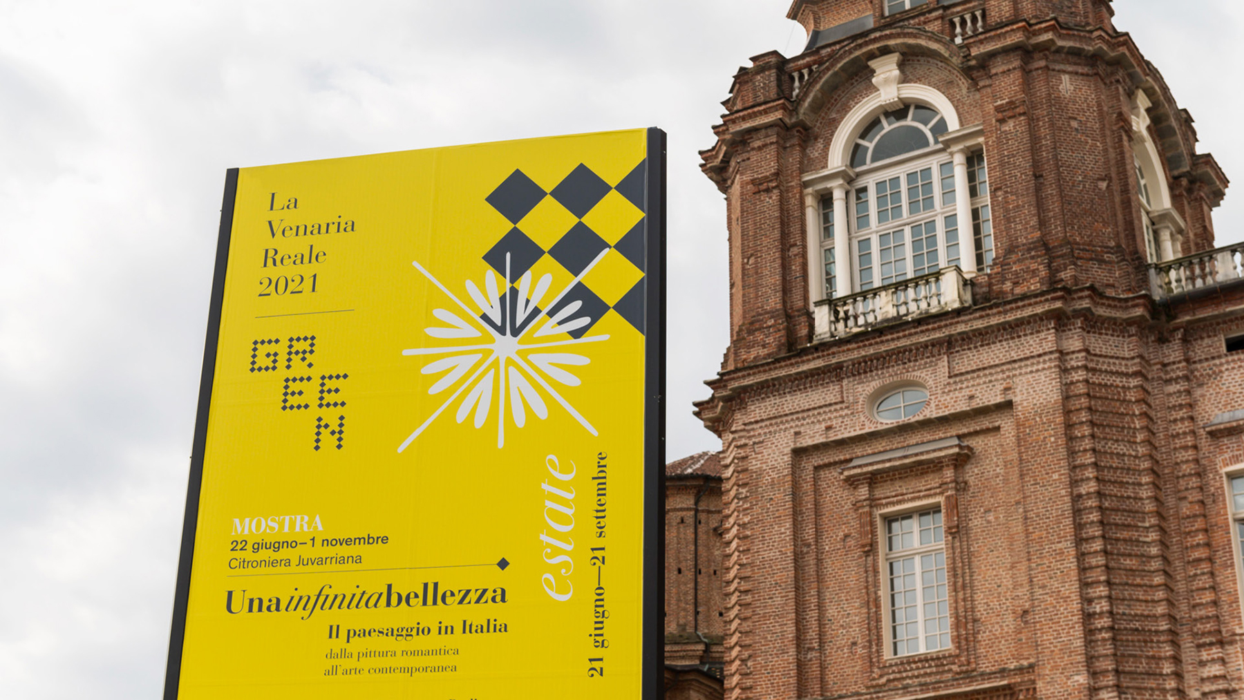
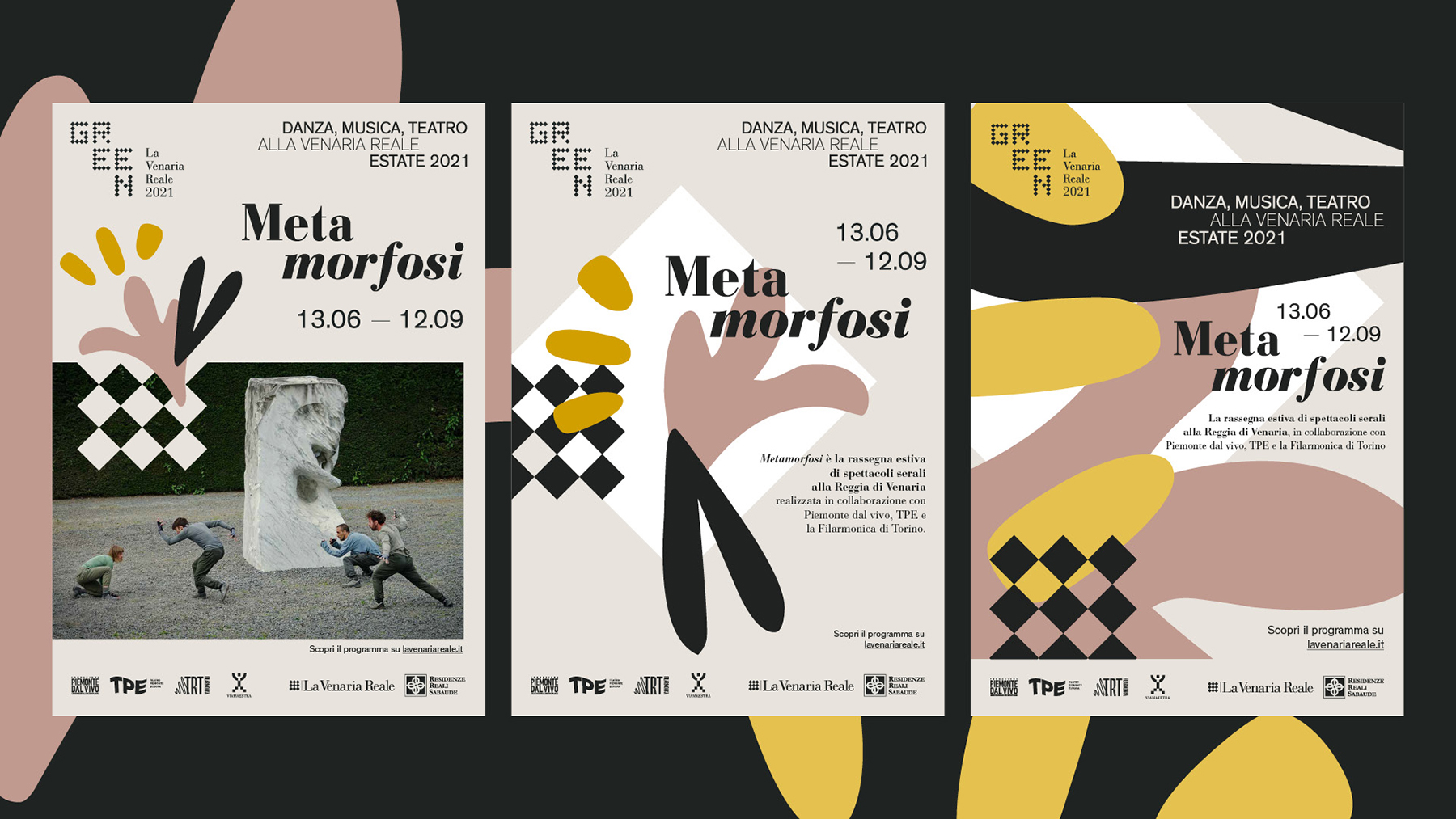
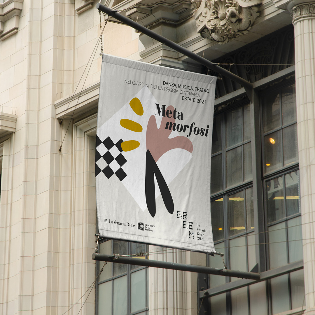
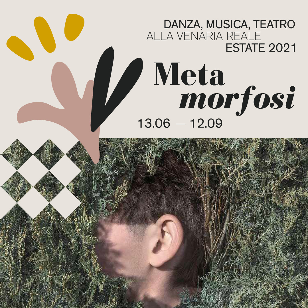
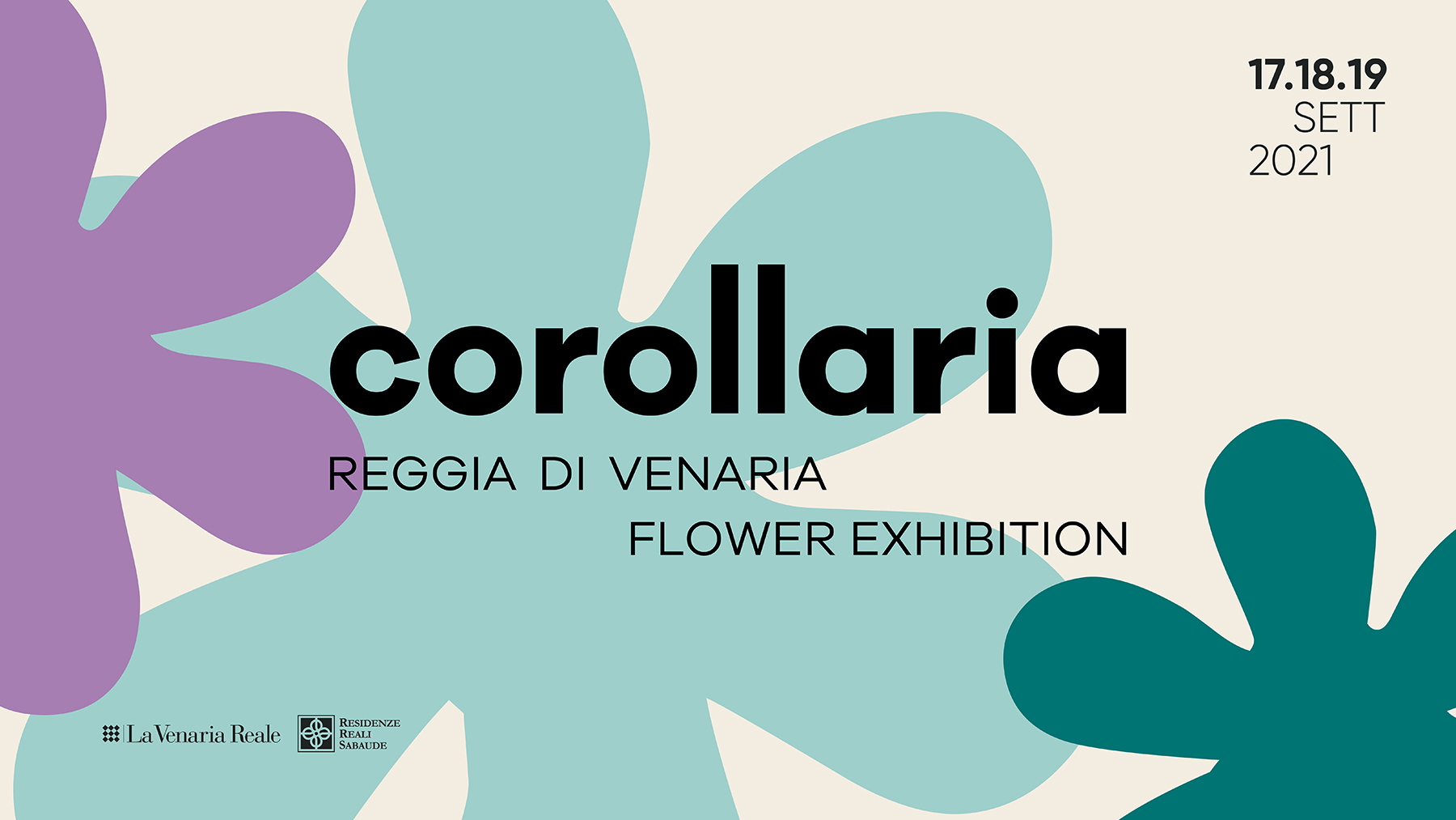
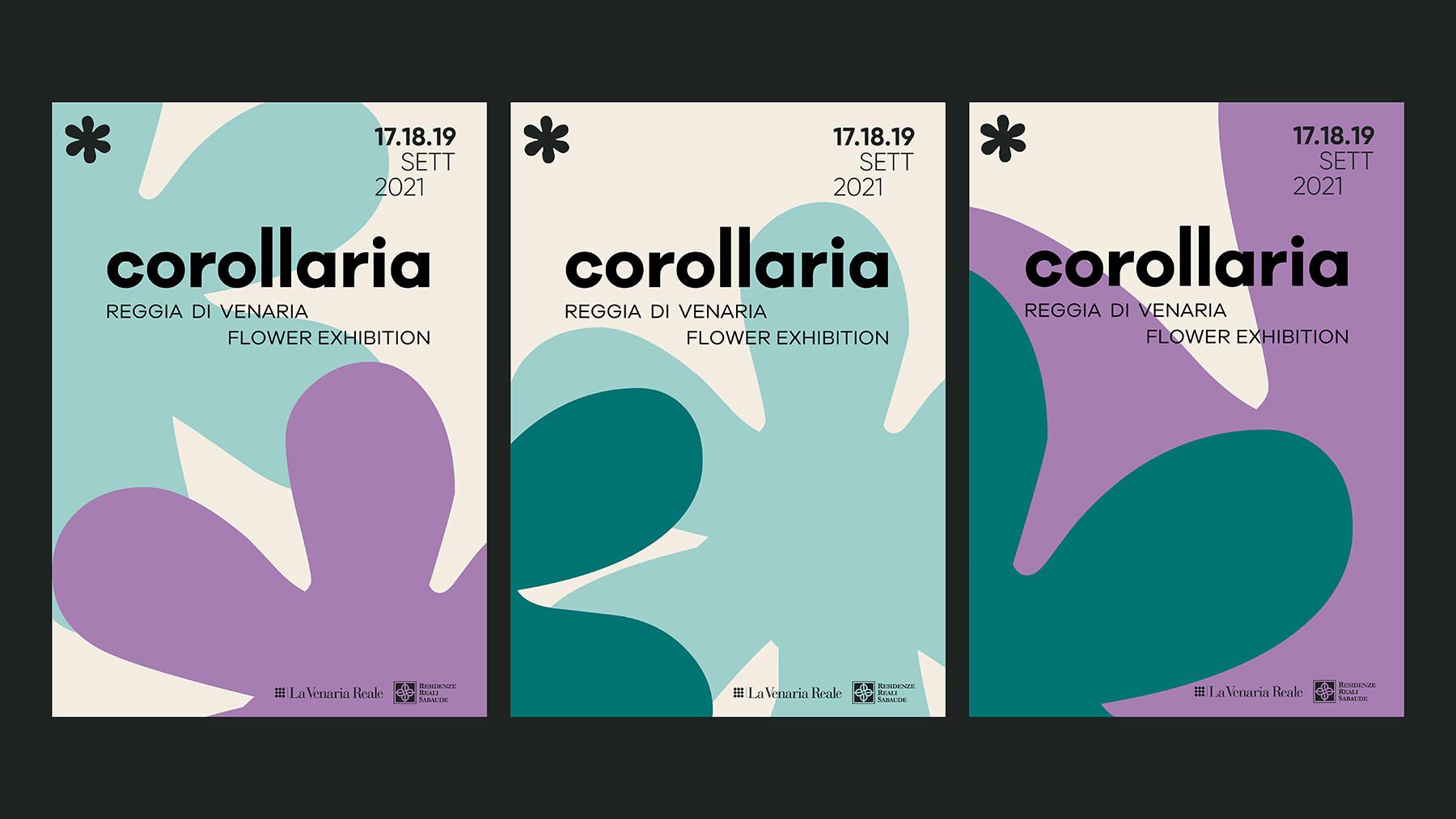
Bellissimo expresses all of this through a visual identity that maximizes the value of existing elements. The project highlights the palace’s most famous symbol: the nine-diamond checkerboard inspired by the floors designed by Filippo Juvarra, already a key element of the logo. To this geometry, the curved lines of a collection of botanical motifs are now added — historical glyphs from the Bodoni typeface, the ornaments of the original Venaria Reale logo.
The combination of these elements creates a flexible, dynamic, living system. Different compositions convey the vibrancy of the place and the richness of its nature, as if the galleries opened onto the gardens and the park. A rare space of art, history, and nature, where architecture and landscape merge in a continuous evolution — just as the palace intended to tell its story. A major poster campaign presents it as a place “Dove il tempo prende vita” (“Where time comes to life.”)
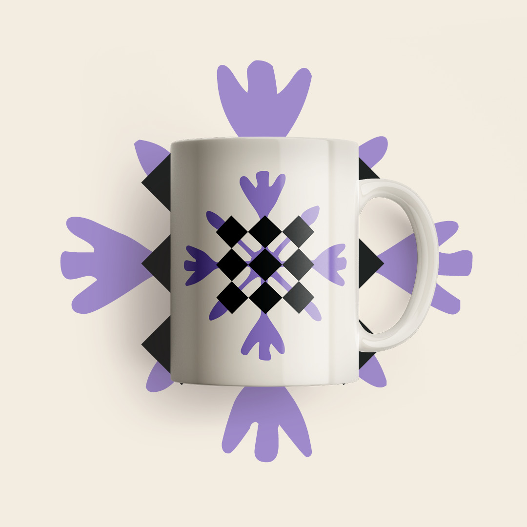
True to its modular logic, the project extends across multiple levels: outdoor signage, social media formats, newsletter redesign, tools for institutional communication. The most significant developments relate to the annual cultural programs and the related exhibitions. Diamonds and glyphs take center stage in new forms — and so the visual communication itself “comes to life.” Bellissimo curates the visual identity for GREEN, the overarching title for the 2021 events and cultural offerings, and creates the imagery for the Metamorfosi performance calendar and Corollaria, a festival dedicated to floral art.
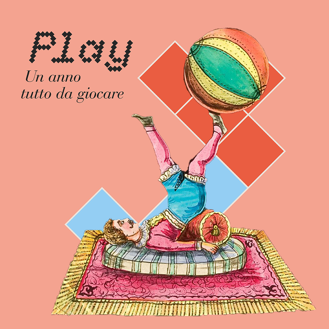
The visual language is always driven by movement. The communication balances recognizability and pop immediacy with the elegance required by a space such as the palace. The journey continues with the visual identity for PLAY, the program that replicates the cultural format of GREEN around a new theme. In this case, the graphic format for the 2022 activities returns to the Venaria’s signature diamonds, imagining a playful “Tetris” of interlocking shapes — a design motif ready to interact with photos and illustrations, highlighting the diagonal rhythm of the compositions.
Communication blends refinement and modernity. It aims for a positioning that is high-end yet approachable, contemporary yet friendly, noble yet playful — speaking to a wide and diverse audience.
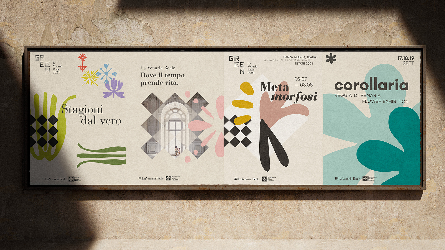
The name of the event, Corollaria, was also created by Bellissimo.
YOU MAY ALSO LIKE
-
Why teach entrepreneurship: an interview with Giancarlo Rocchietti and Barbara Graffino from Enter Academy
It can’t really be labelled as a school, but it’s more than just a training program. Enter Academy is a non-profit foundation that aims to inspire the next generation of entrepreneurs. Supported (...)
Read -
Enter Academy makes its public debut. From naming to website, Bellissimo supports its launch event
It’s always exciting when a brand developed in the studio comes to life — especially when it does so in front of hundreds of people, at such a large and well-attended launch event.With the (...)
Read -
Lavazza Group: Bellissimo receives the Quality Award 2025
Photo: Andrea Guermani Every year, the companies collaborating with Lavazza Group come together for Supplier Coffee Links. The event is designed as a moment of exchange and collaboration across (...)
Read -
Lagrange Prize 2025. New edition, new installations
Photo: Luigi de Palma Each year, the Lagrange Prize reminds us of the pleasure of working with scientific institutions.Promoted by Fondazione CRT and coordinated by the ISI Foundation, the prize (...)
Read