Cantene
-
2019-oggi
-
Cantene
TECH IN MOTION
Even a highly specialized consulting firm can find strength in a visually bold approach. The Cantene case: rebranding, video, website.
Bellissimo completely revamped Cantene’s branding and communication. Cantene is an engineering firm at the forefront of computational fluid dynamics, creating models and scenarios applied to infrastructure safety, buildings, industrial processes, and large events — highly technical yet essential areas.
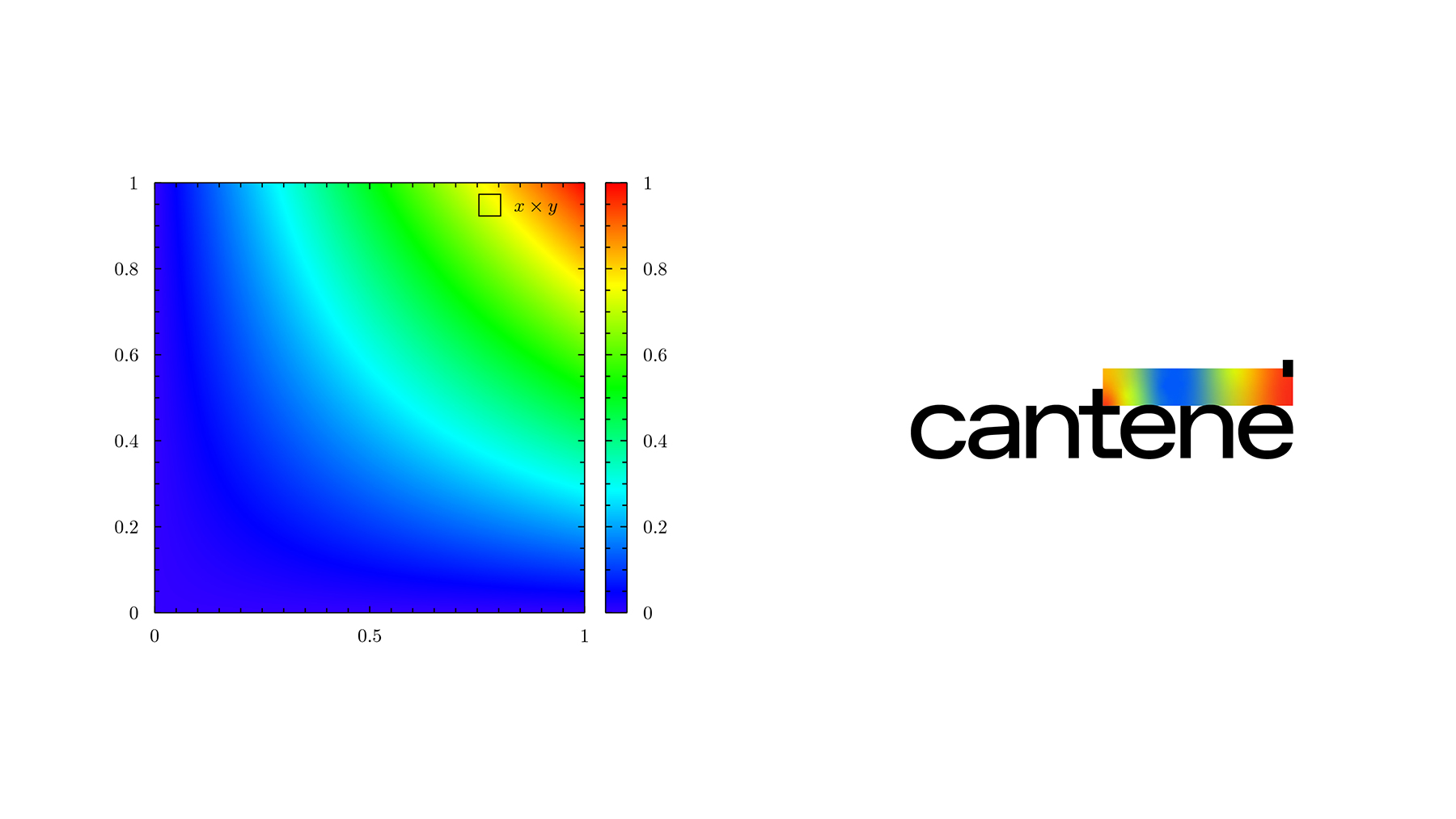
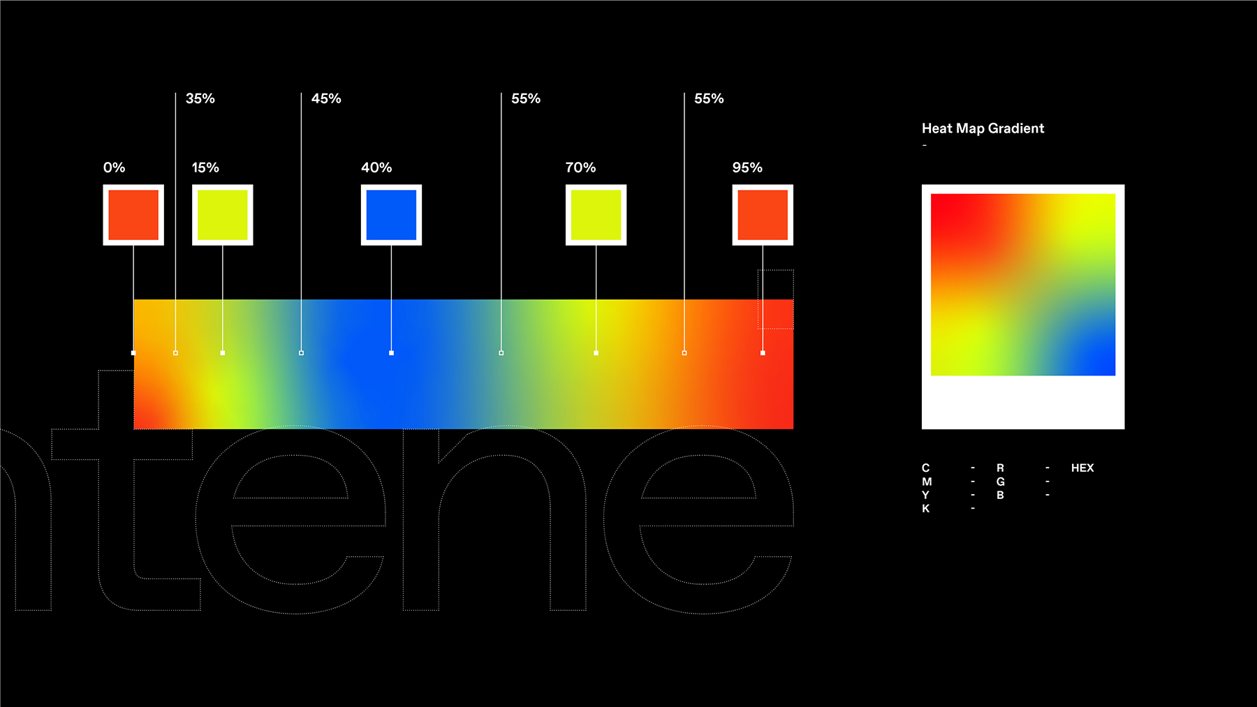
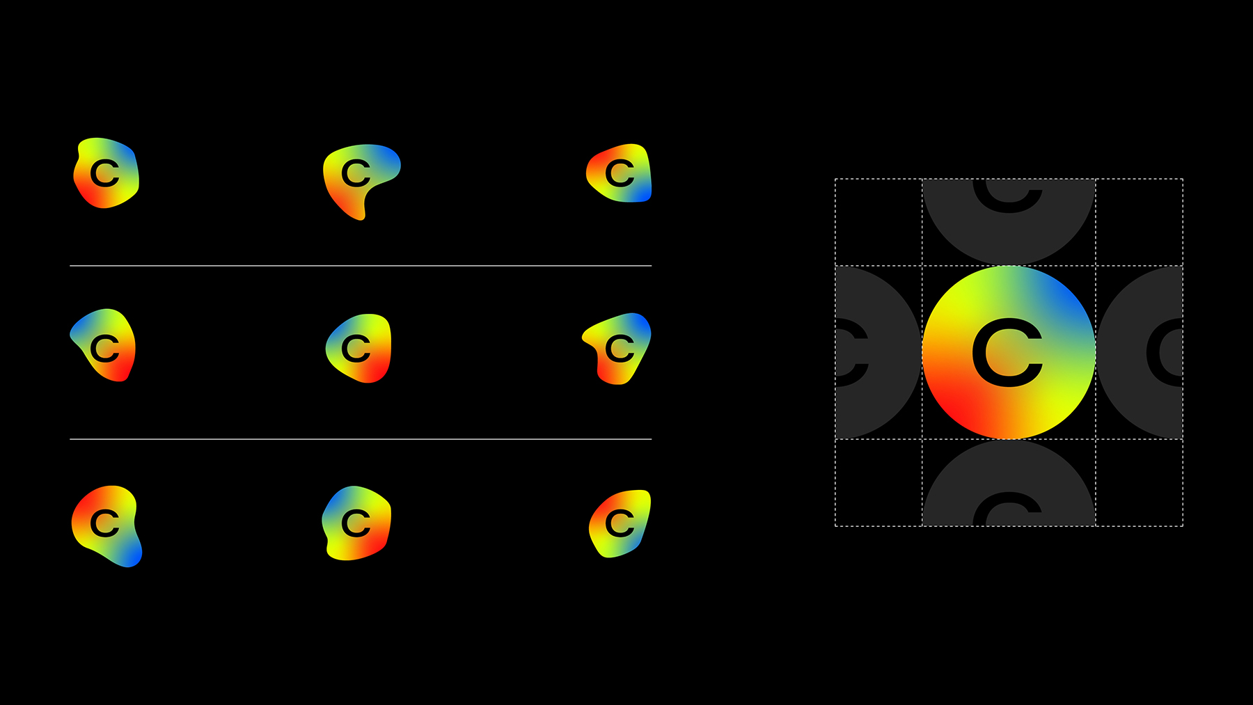
Bellissimo’s project embraces this complexity and turns it into a strength. The visual identity, the centerpiece of the rebranding, highlights this technical aesthetic. The logo’s gradient spectrum draws inspiration from heat map graphics and sets the stage for a digital communication system rich in animation and motion.
A spectrum-driven visual. From logo design to digital communication, the project draws inspiration from the visual language of technical representations.
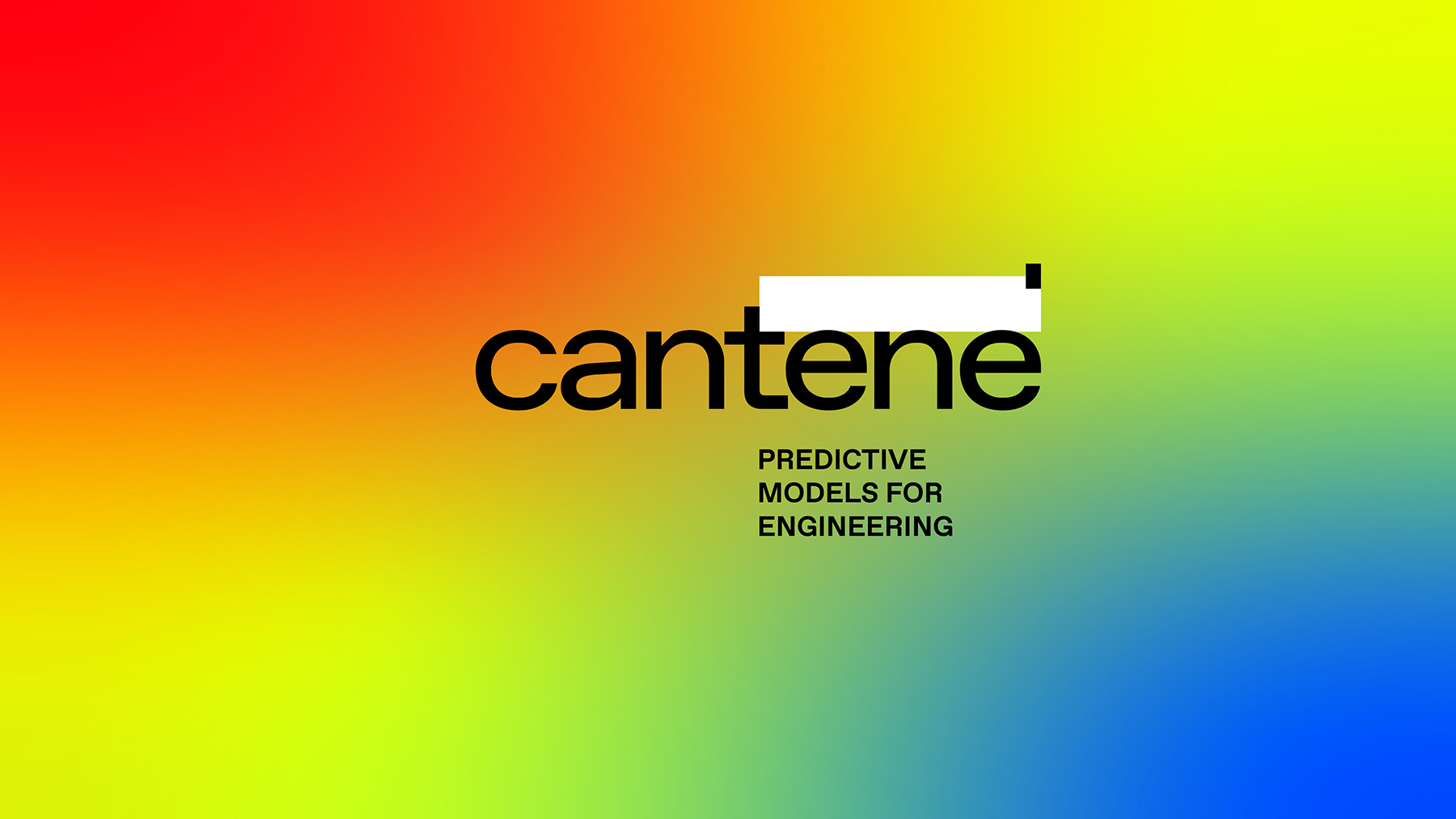
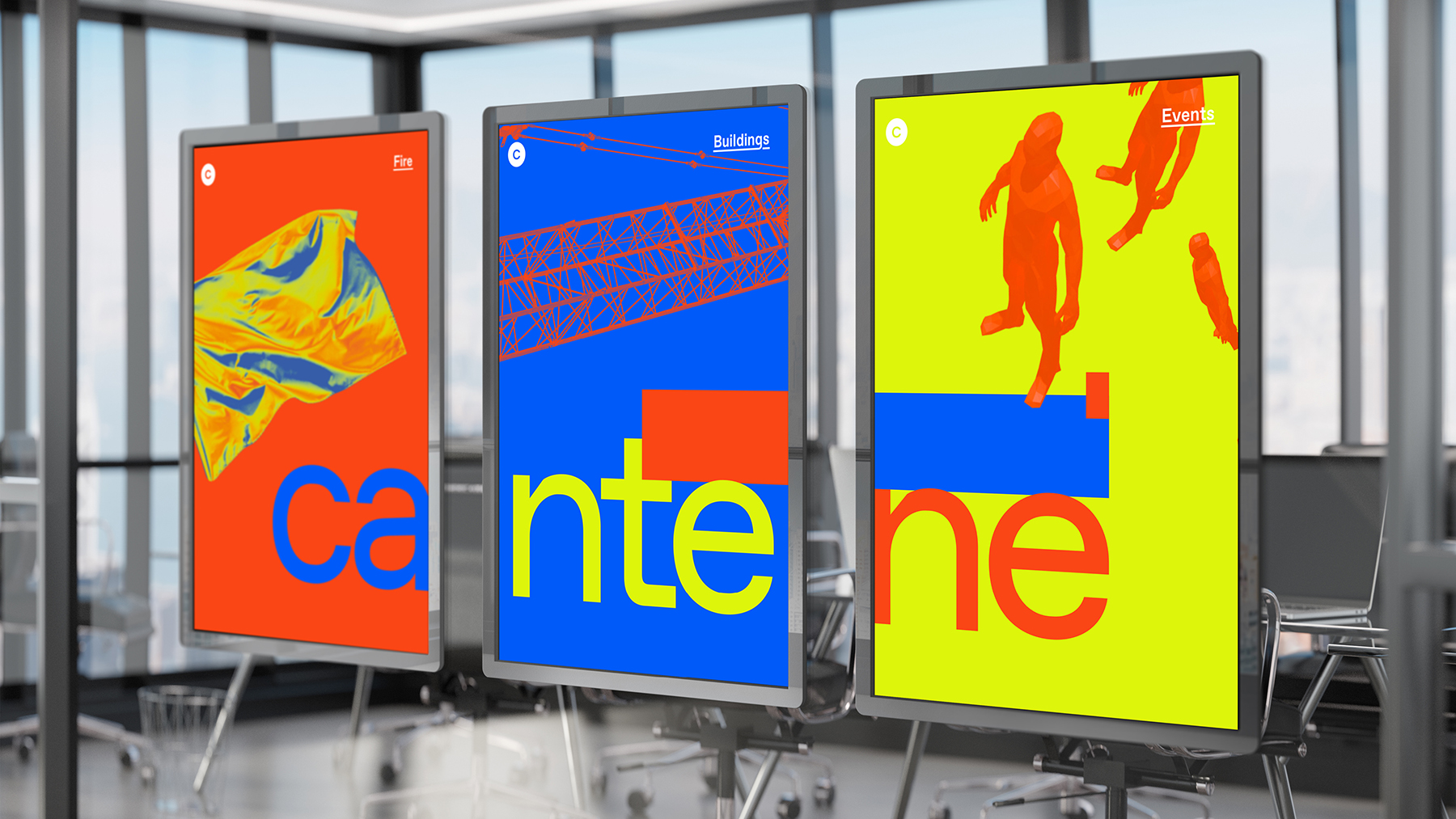
Cantene’s website fully embraces this audacious, boundary-pushing approach, breaking away from typical industry conventions. Acidic colors, low-fi renderings, and animated color variations energize a sharp, “rough” visual style. The distinctive typography, with its broken underlines, reinforces the brand’s confident, self-assured personality.
Not just the visuals. The website experiments with its architecture and navigation, pushing the boundaries of how information is structured and explored.
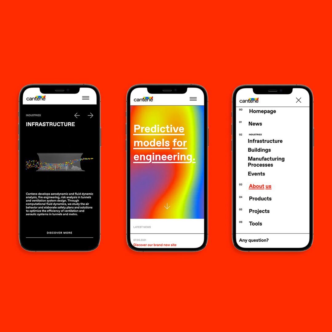
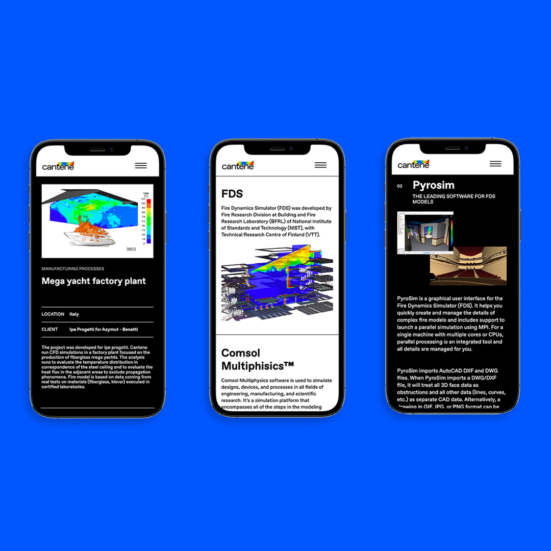
The website’s standout feature is four interactive animations. Visitors can explore colorful environments inspired by Cantene’s work: drawing a heat map over a building plan, directing the movement of a crowd, controlling airflow in a tunnel, or navigating through a three-dimensional cluster of objects.
These special features highlight the “technical” visual language that defines Cantene’s communication. The interactive experiences immerse visitors in Cantene’s world: for those familiar with the field —like the professionals the company serves— they testify to the expertise and confidence in their tools. They also serve as a badge of pride for belonging in a highly specialized, often unseen, but vitally important community of specialists.


YOU MAY ALSO LIKE
-
Why teach entrepreneurship: an interview with Giancarlo Rocchietti and Barbara Graffino from Enter Academy
It can’t really be labelled as a school, but it’s more than just a training program. Enter Academy is a non-profit foundation that aims to inspire the next generation of entrepreneurs. Supported (...)
Read -
Enter Academy makes its public debut. From naming to website, Bellissimo supports its launch event
It’s always exciting when a brand developed in the studio comes to life — especially when it does so in front of hundreds of people, at such a large and well-attended launch event.With the (...)
Read -
Lavazza Group: Bellissimo receives the Quality Award 2025
Photo: Andrea Guermani Every year, the companies collaborating with Lavazza Group come together for Supplier Coffee Links. The event is designed as a moment of exchange and collaboration across (...)
Read -
Lagrange Prize 2025. New edition, new installations
Photo: Luigi de Palma Each year, the Lagrange Prize reminds us of the pleasure of working with scientific institutions.Promoted by Fondazione CRT and coordinated by the ISI Foundation, the prize (...)
Read