Club to Club 2012
JUMPING INTO THE FESTIVAL
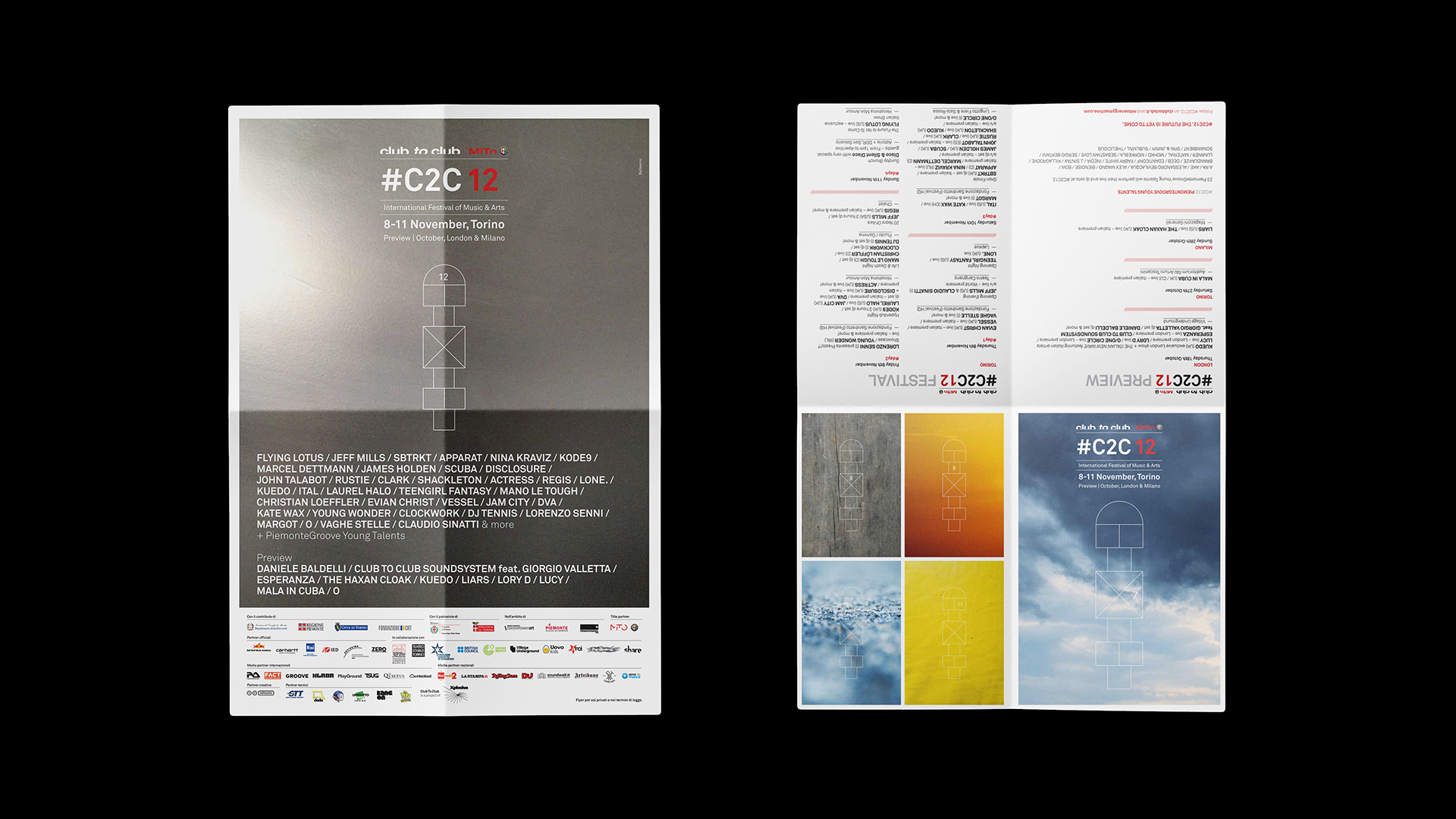
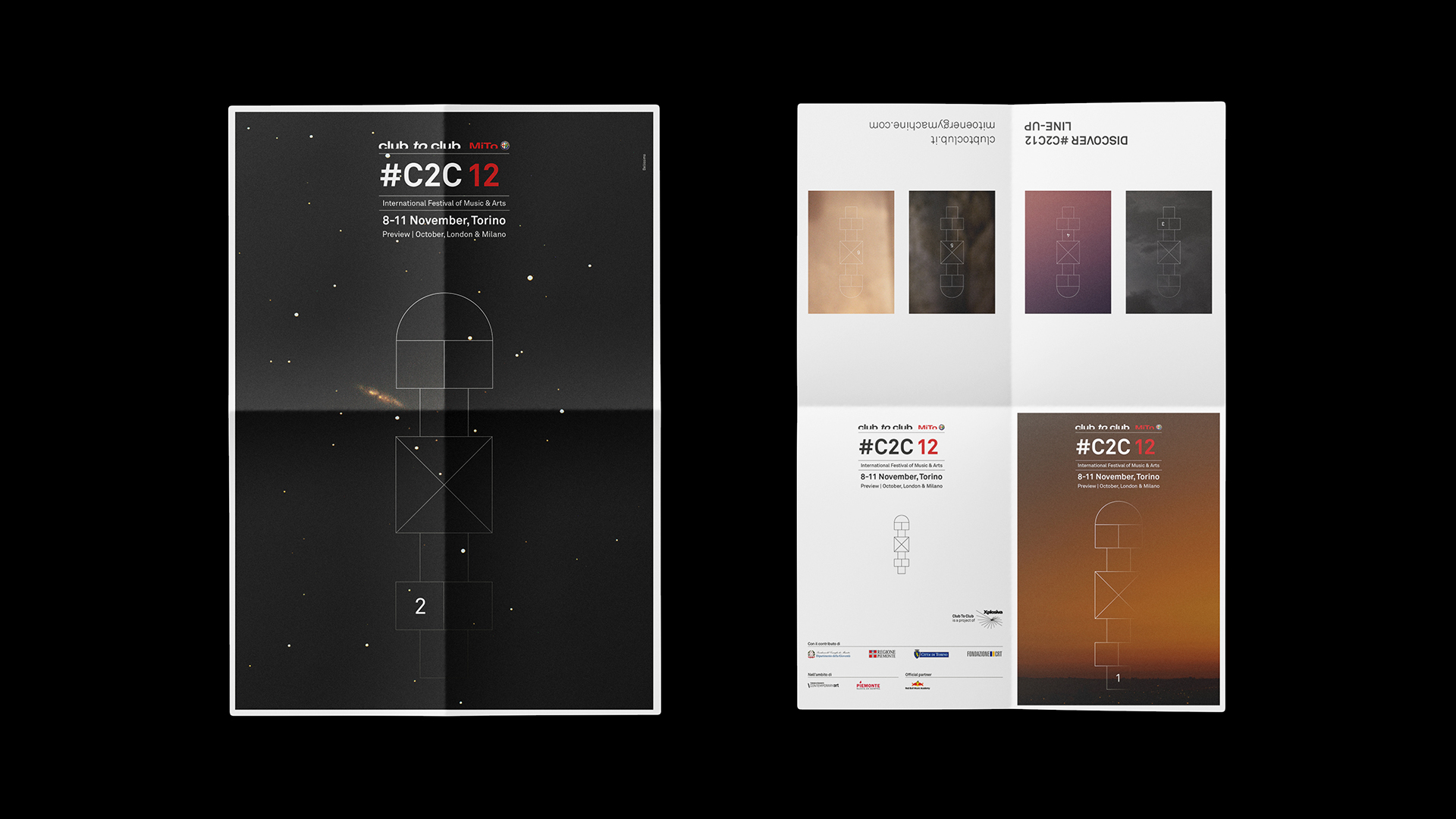
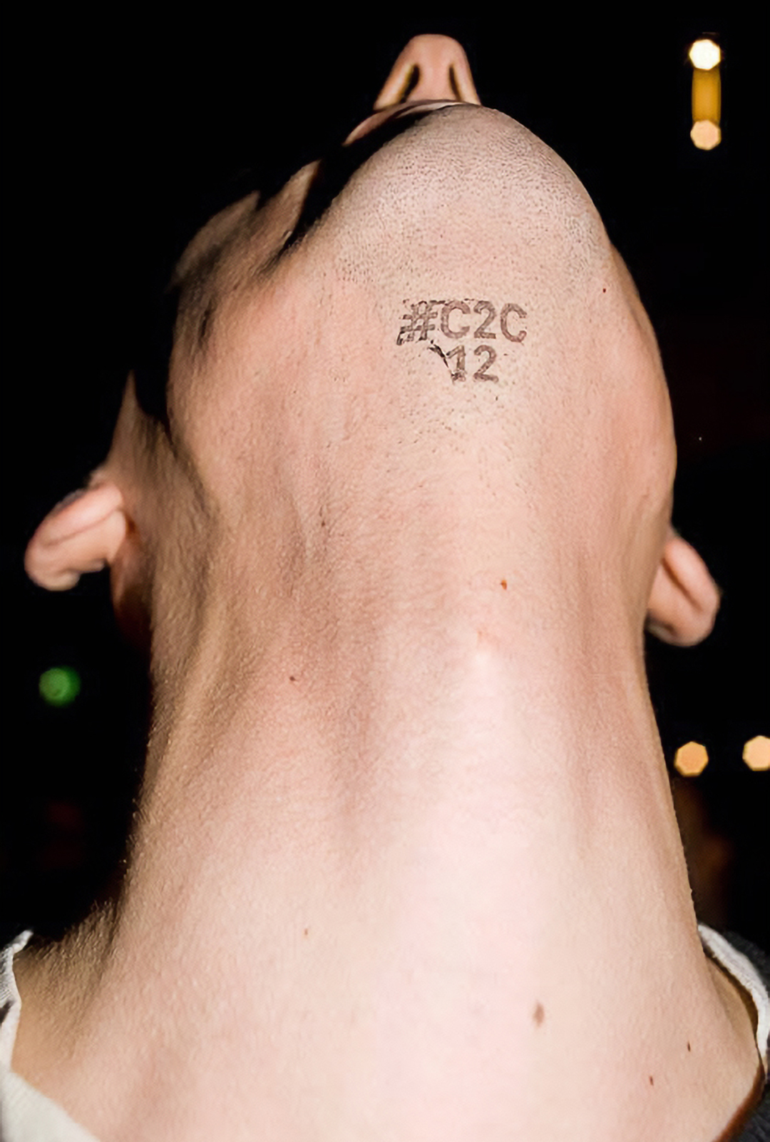
A sign appears in the sky. It is the ever-changing visual of #C2C12, the twelfth edition of Club to Club.
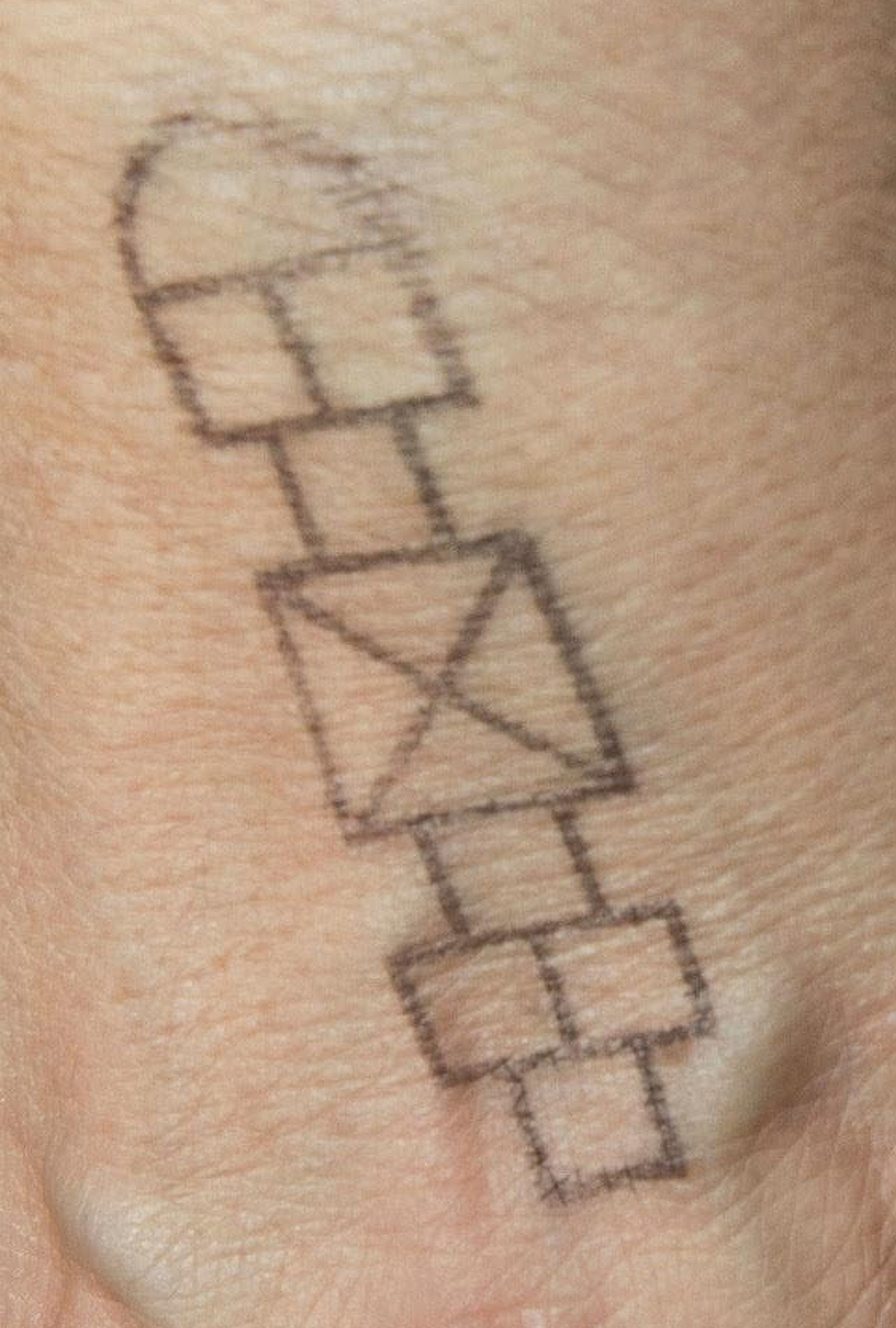
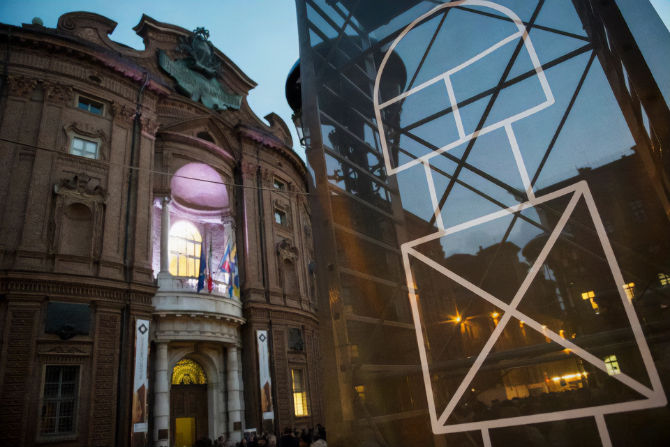
A symbol composed of simple forms appears in the sky and against a series of unidentified textured backgrounds. A simple, immediate image that taps into our visual memory and our most primal instincts — people looking up at the sky, searching for meaning in the signs they see. At first glance, it feels familiar, something we know how to read. Yet at the same time, it confronts us with a question. What is it? Where does it come from? Why is it there? What does it mean?

Starting from a core principle of visual literacy —we see only what we are capable of seeing— Bellissimo returned, for the visual identity and campaign of Club to Club 2012, to the visual language that feels most its own: evocative, surreal, experimental.
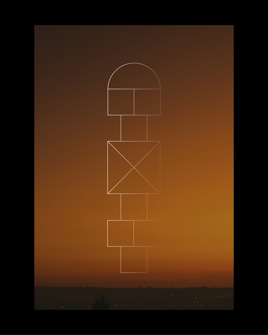
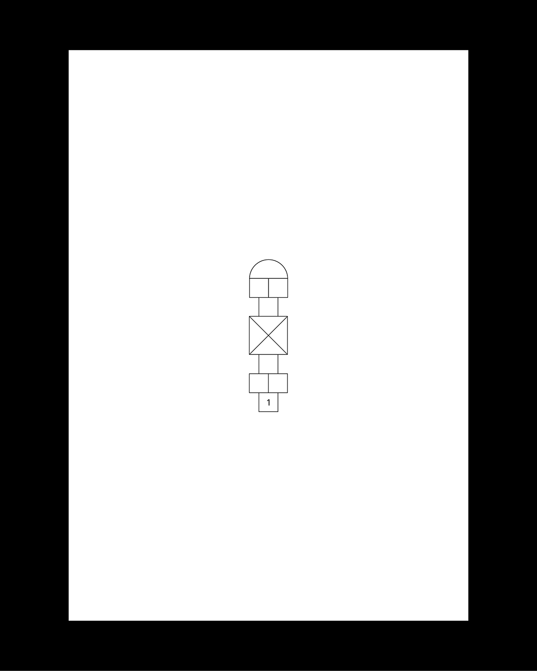
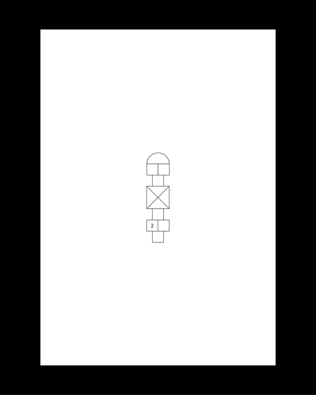
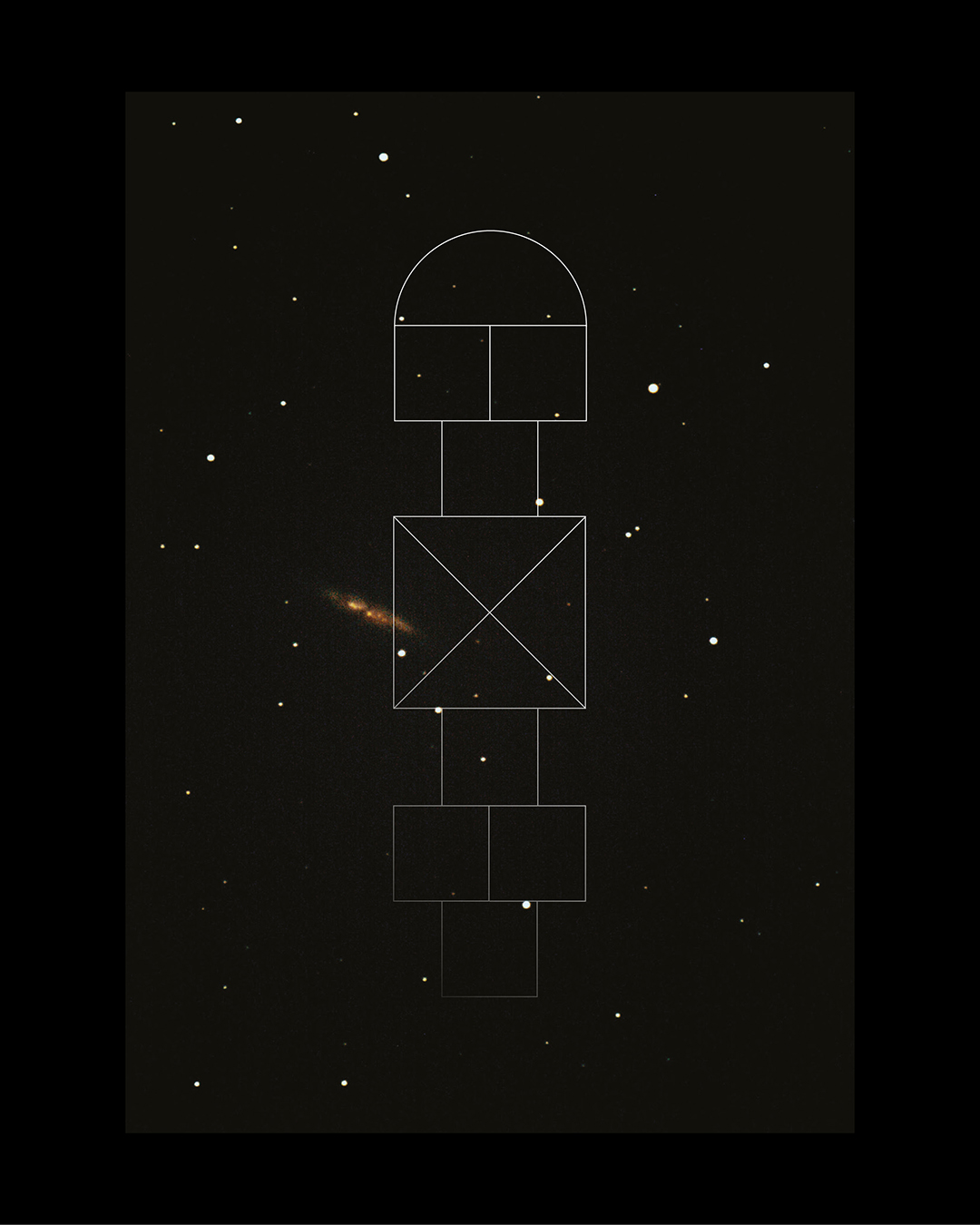
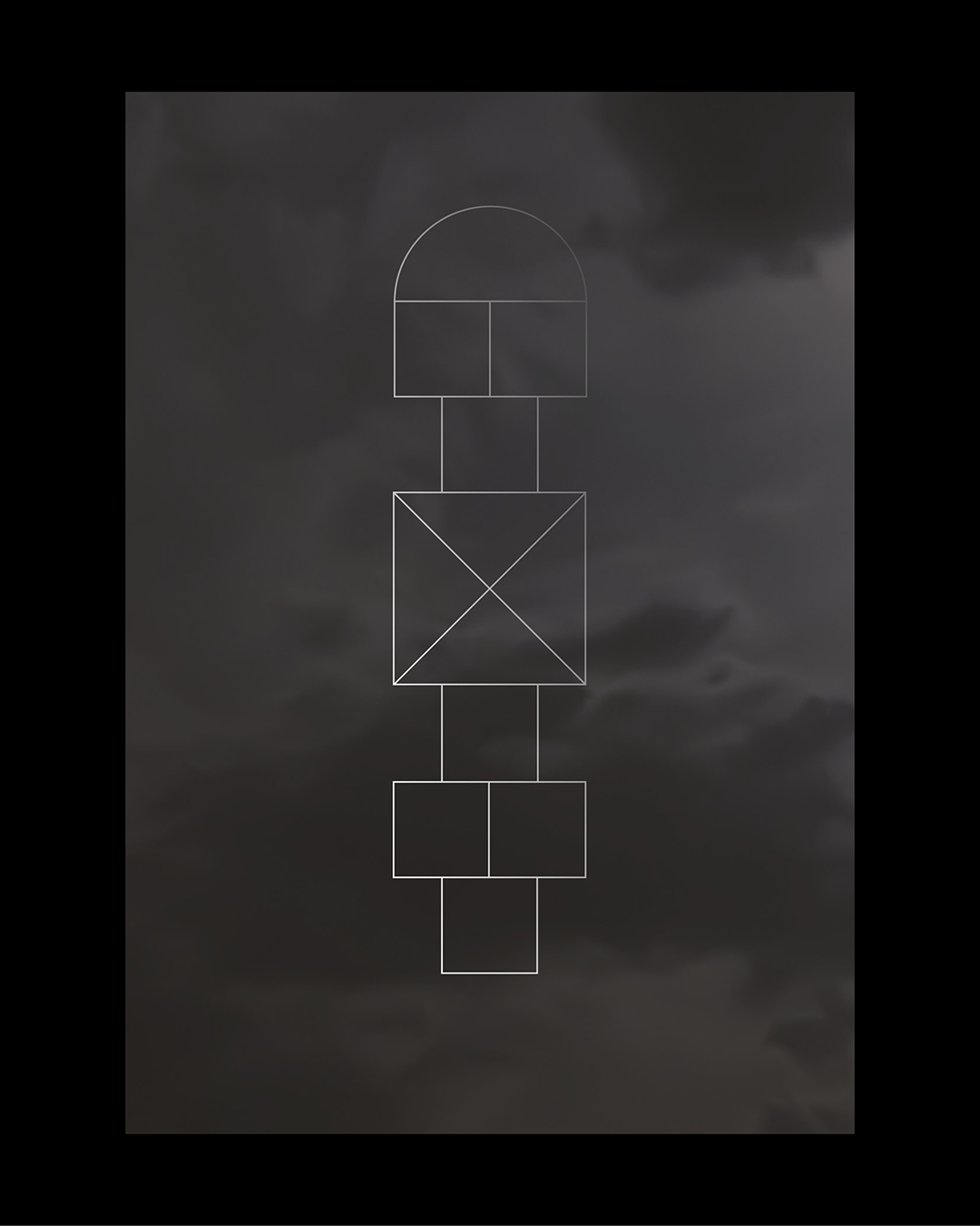
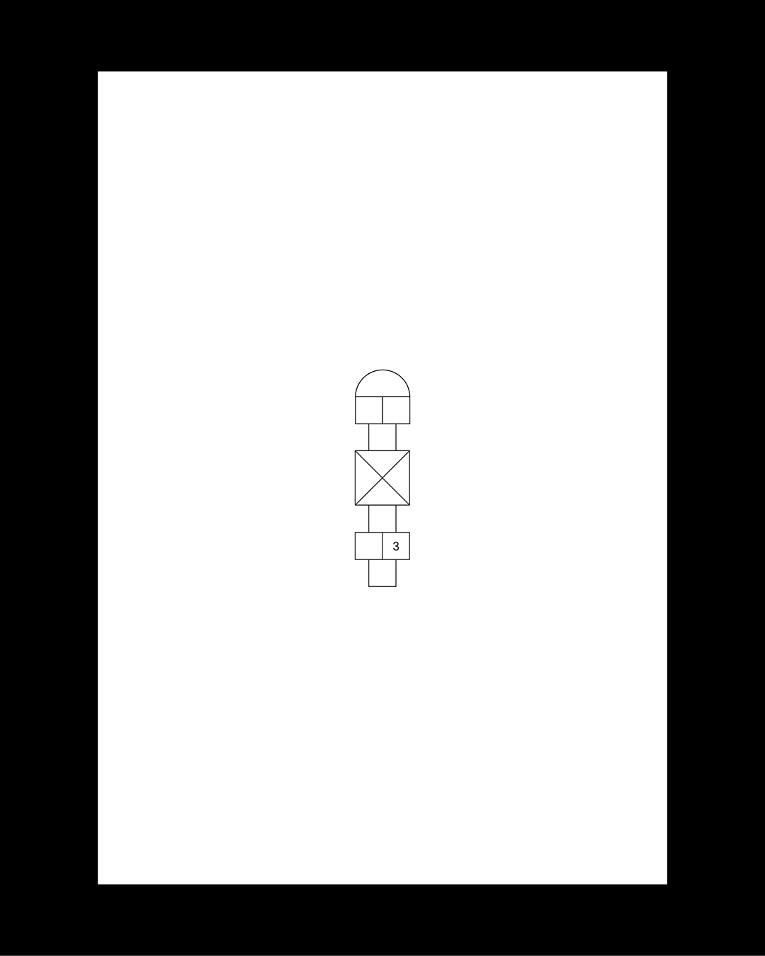
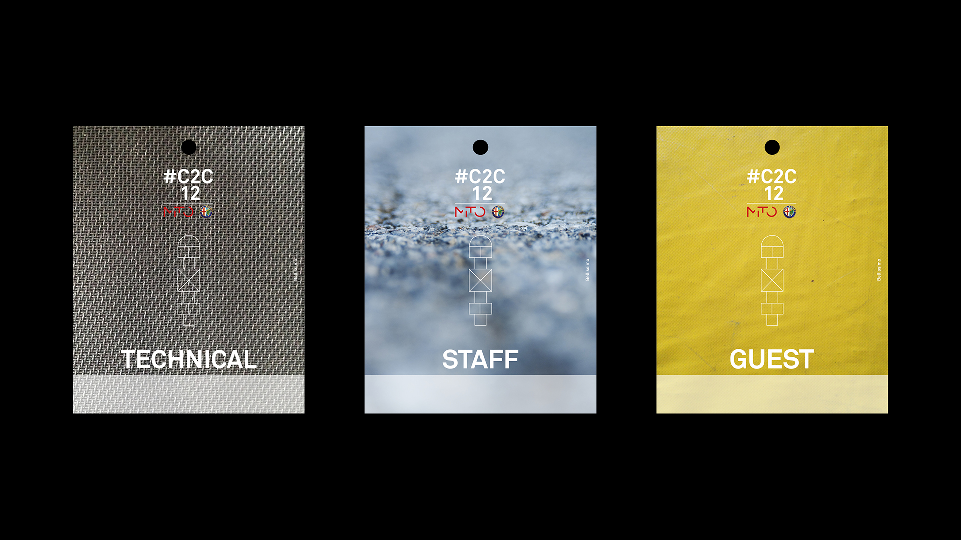
The symbol at the center of the posters, flyers, and videos promoting the festival is a hopscotch grid— as it’s called in New York courtyards— the children’s game drawn on the ground with chalk and then jumped through. This version was designed specifically for #C2C12 and, fittingly, features twelve squares.
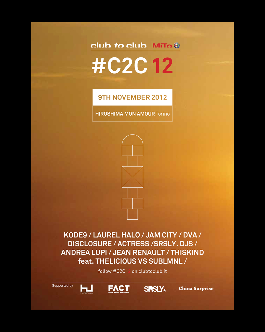
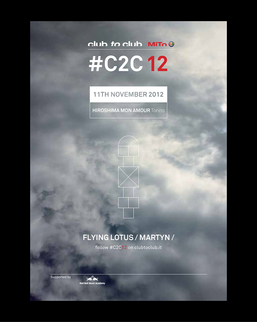
But the symbol is not only about playfulness and numerology. The hopscotch grid becomes a totem around which the festival’s community can gather. “The visual identity was designed to strike, intrigue, and bring together not only the festival’s most devoted audience, but also new followers, around a shared symbol of recognition,” says Luca Ballarini, founder and creative director of Bellissimo. “It’s no coincidence that, on the verbal side, we suggested that the festival’s artistic director turn the acronym into a hashtag. #C2C12 becomes something to follow.”
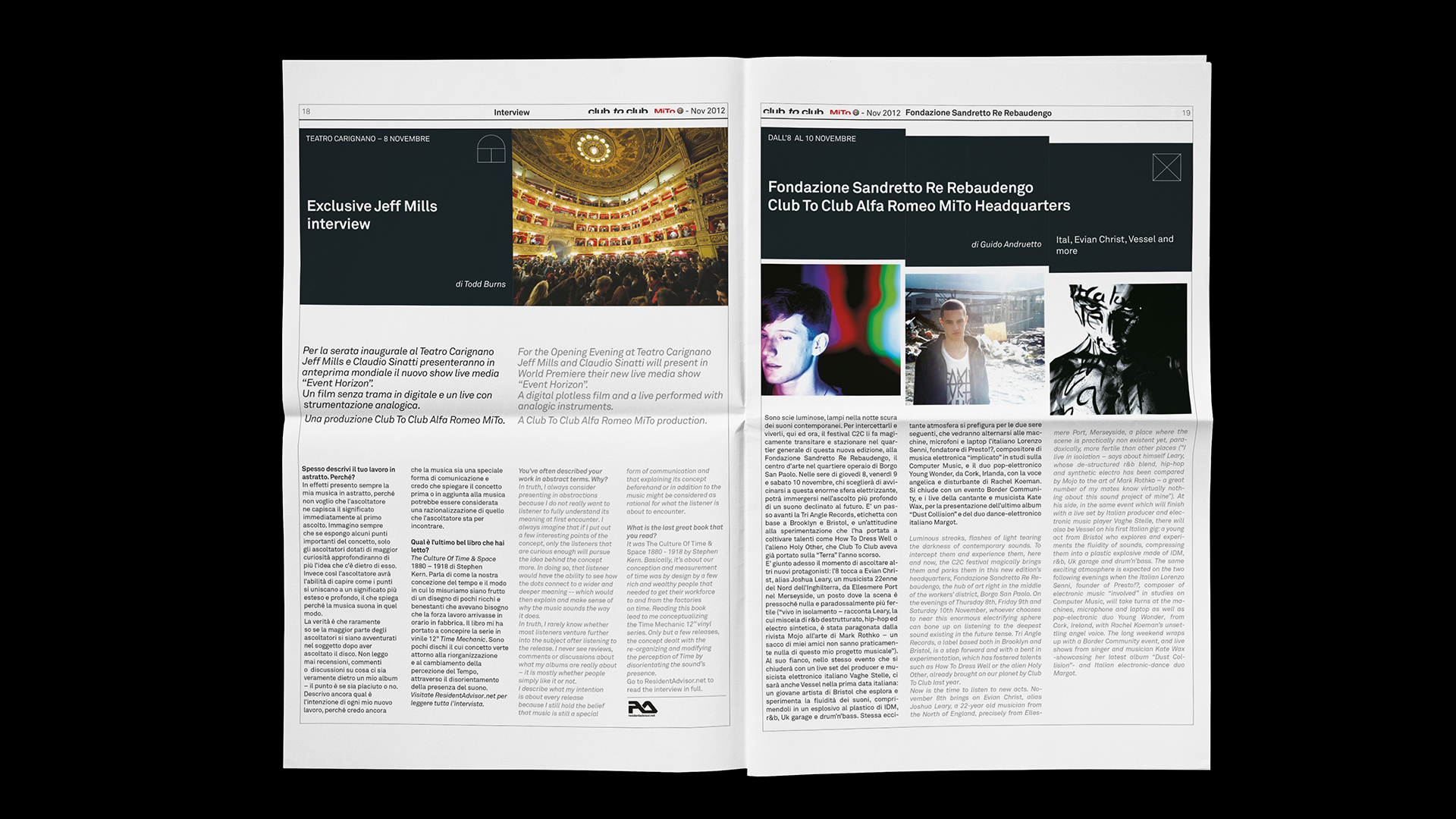
Images from the book We Call It Avant-Pop (2024), retracing the first 20 years of C2C Festival. Photos by Andrea Macchia
YOU MAY ALSO LIKE
-
MaaS for Italy: activities and results at a glance. The white paper designed by Bellissimo for the Italian Government
MaaS for Italy is Italy’s first large-scale pilot of the Mobility as a Service model. Funded with €56.9 million, the program involved six major cities and seven territories, encouraging local (...)
Read -
New languages for evolving institutions. A conversation with Massimiliano Cipolletta, President of the Torino Chamber of Commerce
Nearly a year after the rebrand, Bellissimmo’s project for the Torino Chamber of Commerce has been rolled out consistently across the territory — an opportunity now to reflect on the value of (...)
Read -
Packaging on display. At the ADI Design Museum, the three Boxes for inspirational design created by Bellissimo for Bombay Sapphire
From March 4 to March 26, 2026, the ADI Design Museum in Milan hosts the exhibition Design di Filiera. La Filiera del Packaging, curated by Carlo Branzaglia and Wladimiro Bendandi and promoted by (...)
Read -
Why teach entrepreneurship: an interview with Giancarlo Rocchietti and Barbara Graffino from Enter Academy
It can’t really be labelled as a school, but it’s more than just a training program. Enter Academy is a non-profit foundation that aims to inspire the next generation of entrepreneurs. Supported (...)
Read