Cantene
-
2019-oggi
-
Cantene
TECH IN MOTION
Even a highly specialized consulting firm can find strength in a visually bold approach. The Cantene case: rebranding, video, website.
Bellissimo completely revamped Cantene’s branding and communication. Cantene is an engineering firm at the forefront of computational fluid dynamics, creating models and scenarios applied to infrastructure safety, buildings, industrial processes, and large events — highly technical yet essential areas.
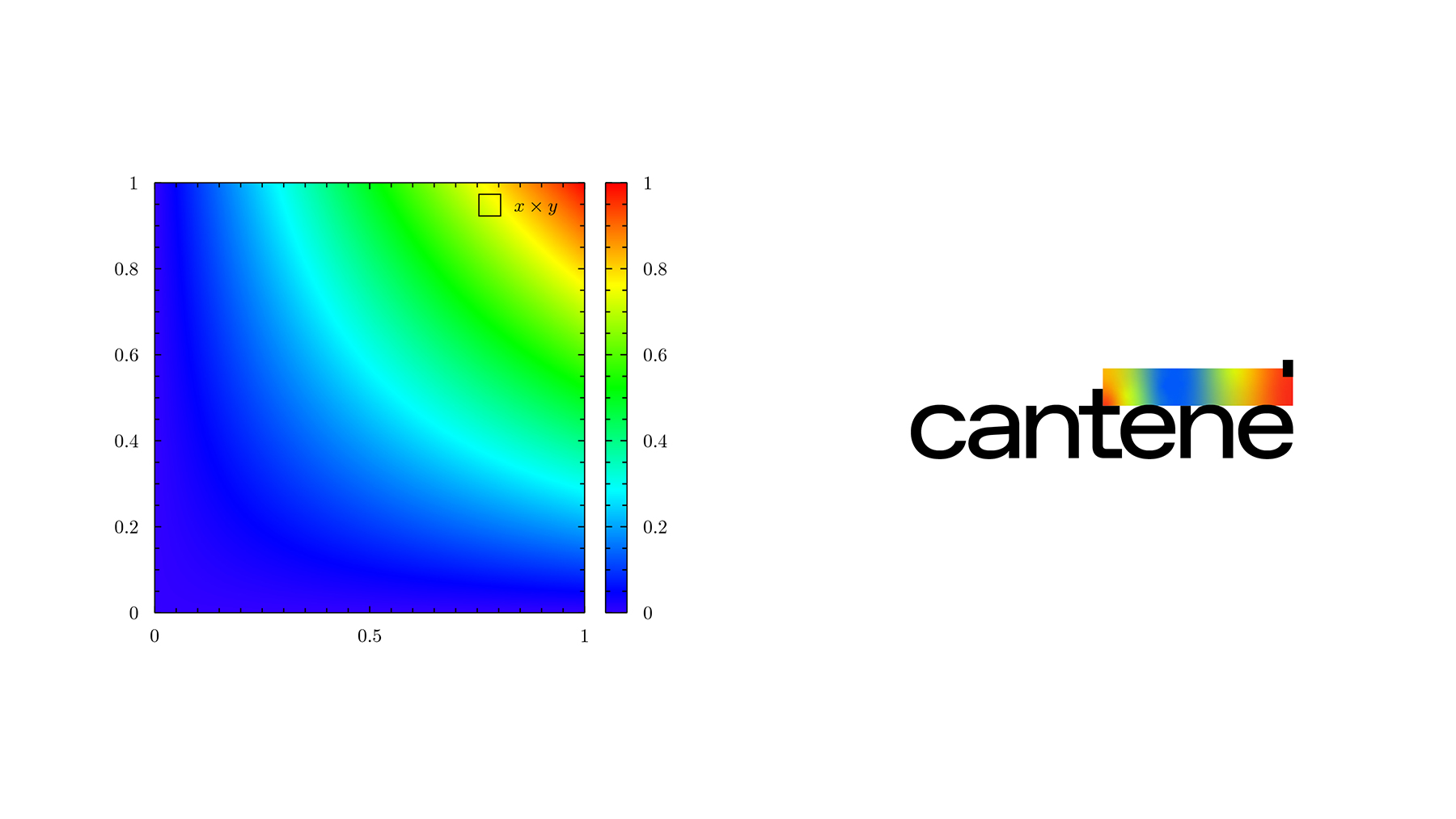
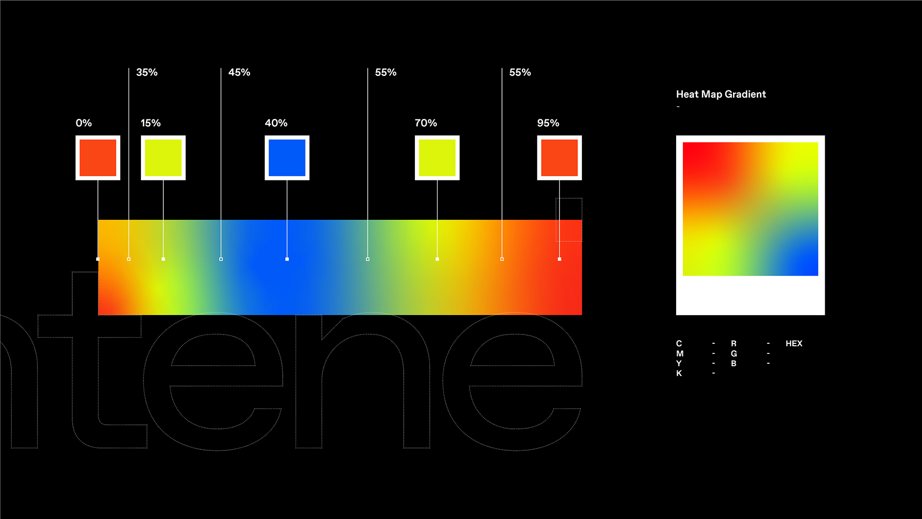
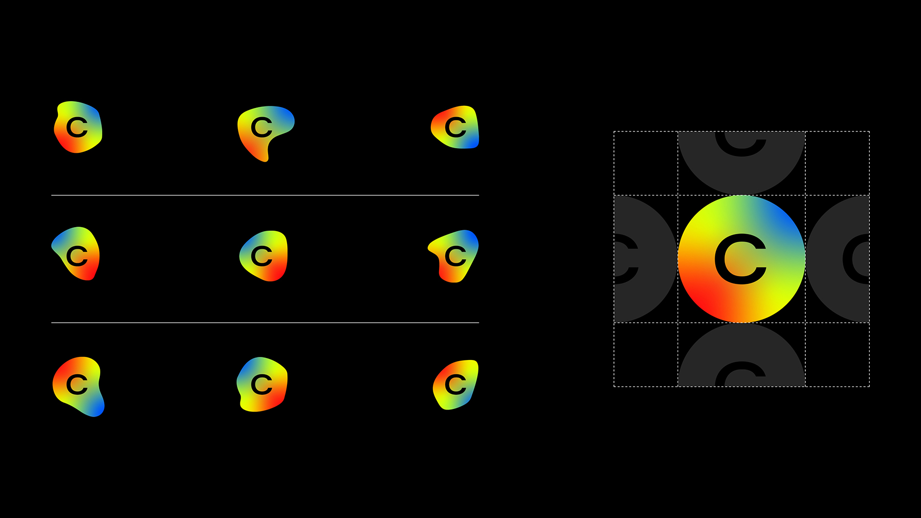
Bellissimo’s project embraces this complexity and turns it into a strength. The visual identity, the centerpiece of the rebranding, highlights this technical aesthetic. The logo’s gradient spectrum draws inspiration from heat map graphics and sets the stage for a digital communication system rich in animation and motion.
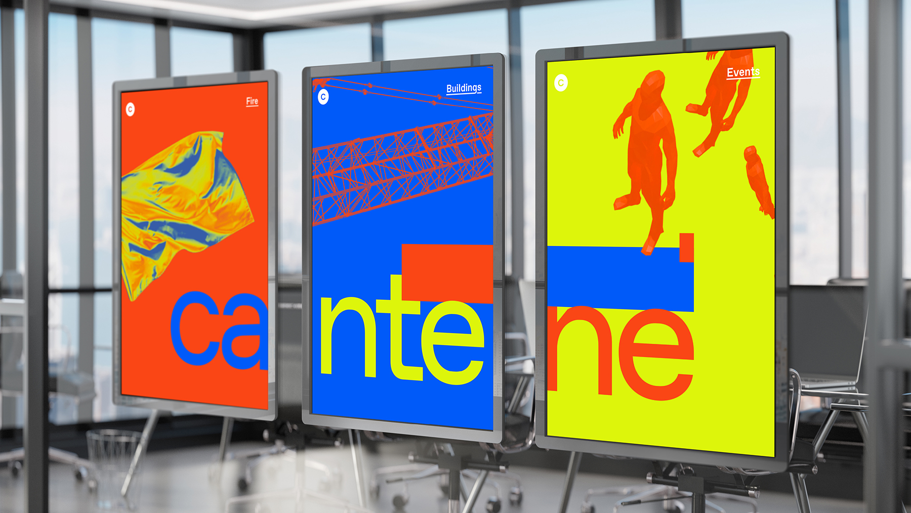
A spectrum-driven visual. From logo design to digital communication, the project draws inspiration from the visual language of technical representations.
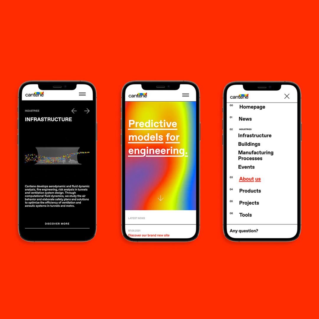
Cantene’s website fully embraces this audacious, boundary-pushing approach, breaking away from typical industry conventions. Acidic colors, low-fi renderings, and animated color variations energize a sharp, “rough” visual style. The distinctive typography, with its broken underlines, reinforces the brand’s confident, self-assured personality.
Not just the visuals. The website experiments with its architecture and navigation, pushing the boundaries of how information is structured and explored.
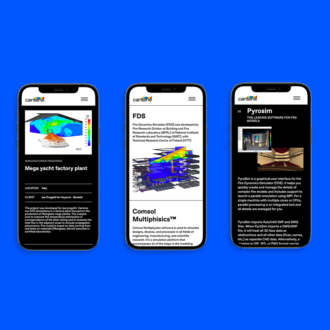
The website’s standout feature is four interactive animations. Visitors can explore colorful environments inspired by Cantene’s work: drawing a heat map over a building plan, directing the movement of a crowd, controlling airflow in a tunnel, or navigating through a three-dimensional cluster of objects.
These special features highlight the “technical” visual language that defines Cantene’s communication. The interactive experiences immerse visitors in Cantene’s world: for those familiar with the field —like the professionals the company serves— they testify to the expertise and confidence in their tools. They also serve as a badge of pride for belonging in a highly specialized, often unseen, but vitally important community of specialists.

YOU MAY ALSO LIKE
-
Packaging and solidarity. A special edition of Lavazza ¡Tierra! at Esselunga in support of Ecuador. Visuals by Bellissimo
Shoppers visiting Esselunga supermarkets these days will find a special edition of Lavazza ¡Tierra! on the shelves, the organic coffee range that has long reflected the company’s commitment to (...)
Read -
AlpTextyles, the EU Cohesion Policy project, is shortlisted for the 2026 REGIOSTARS Awards, promoted by the European Commission
Beautiful news for AlpTextyles – Intertwining Cultures. The Interreg Alpine Space project, for which we served as communication partner from 2023 to 2025, has been selected as one of the 25 (...)
Read -
MaaS for Italy: activities and results at a glance. The white paper designed by Bellissimo for the Italian Government
MaaS for Italy is Italy’s first large-scale pilot of the Mobility as a Service model. Funded with €56.9 million, the program involved six major cities and seven territories, encouraging local (...)
Read -
New languages for evolving institutions. A conversation with Massimiliano Cipolletta, President of the Torino Chamber of Commerce
Nearly a year after the rebrand, Bellissimmo’s project for the Torino Chamber of Commerce has been rolled out consistently across the territory — an opportunity now to reflect on the value of (...)
Read