Fondazione Alia Falck
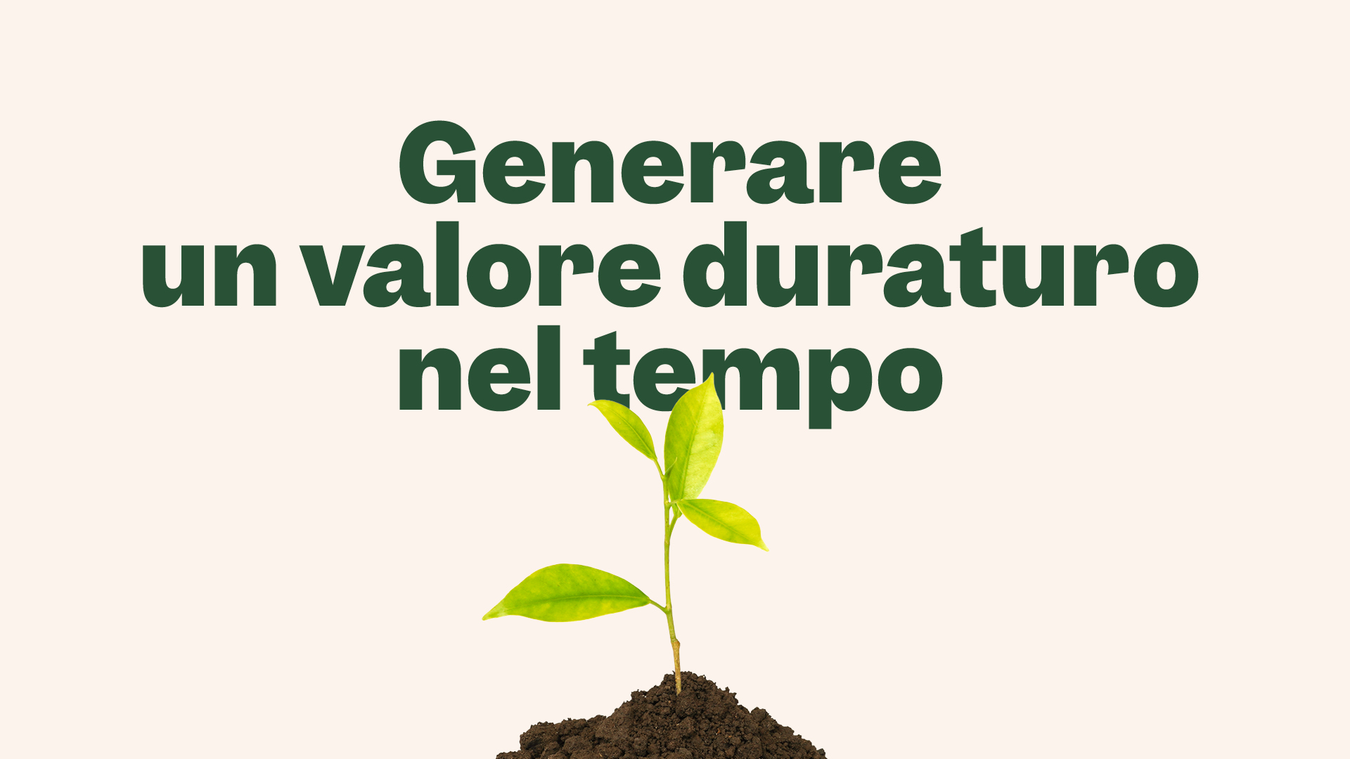
The new face of philanthropy
A family foundation chose to introduce itself to the Milanese public —and to Italy’s nonprofit sector— with a model of active philanthropy and a bold visual identity. Bellissimo curated the entire process.
Fondazione Alia Falck is the name under which Fondazione Falck, the historic charitable organization linked to the Falck industrial group, is relaunching its social initiatives. Its establishment is connected to a series of corporate divestments that also gave rise to the Larry family office, that is part of the same brand strategy and brand identity project managed by Bellissimo.
The branding project began as a standard practice, with a series of interviews involving all key stakeholders, and led to the development of a shared value platform for the two organizations —the foundation and the family office— both united by a forward-looking vision based on responsibility, expertise, and the ability to act as enablers. From this shared core, the brand identities then address very different audiences and needs.

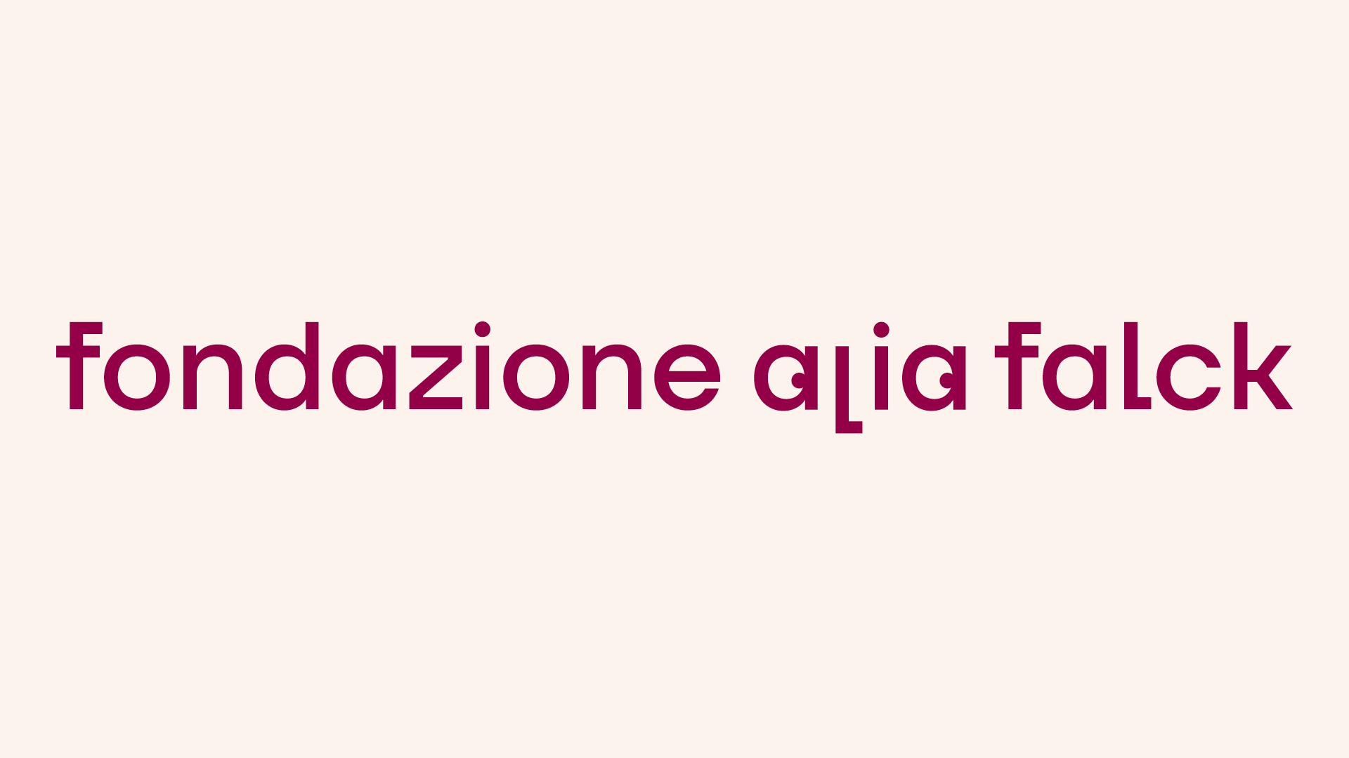
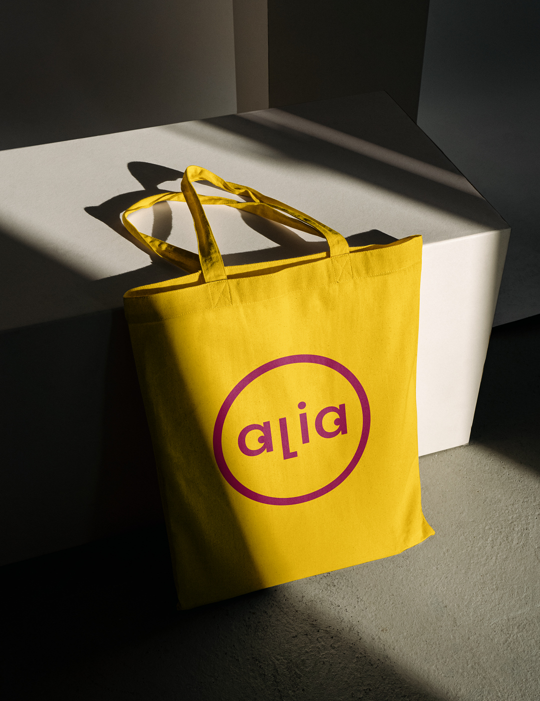
“Alia” is a subtle tribute to Alberto and Cecilia Falck, key figures in the family branch active in these new organizations — the name is formed from the first and last letters of their names.

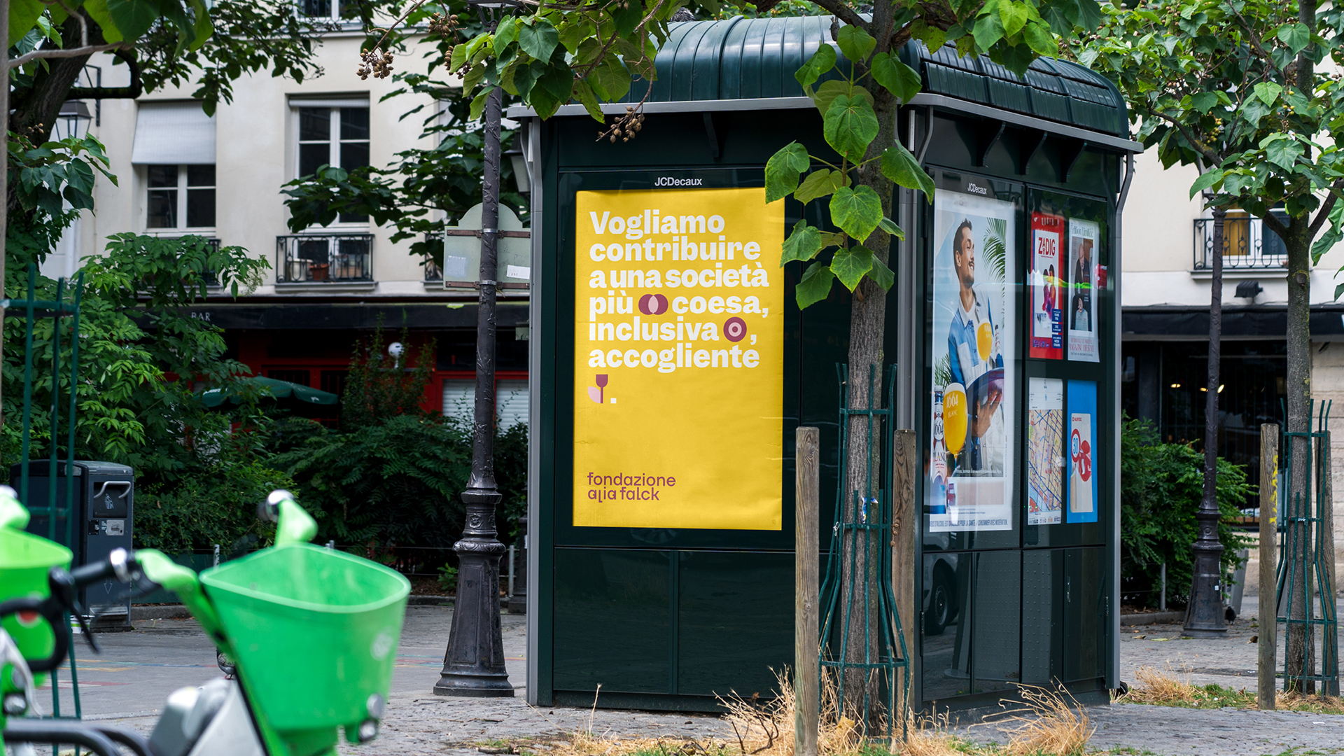
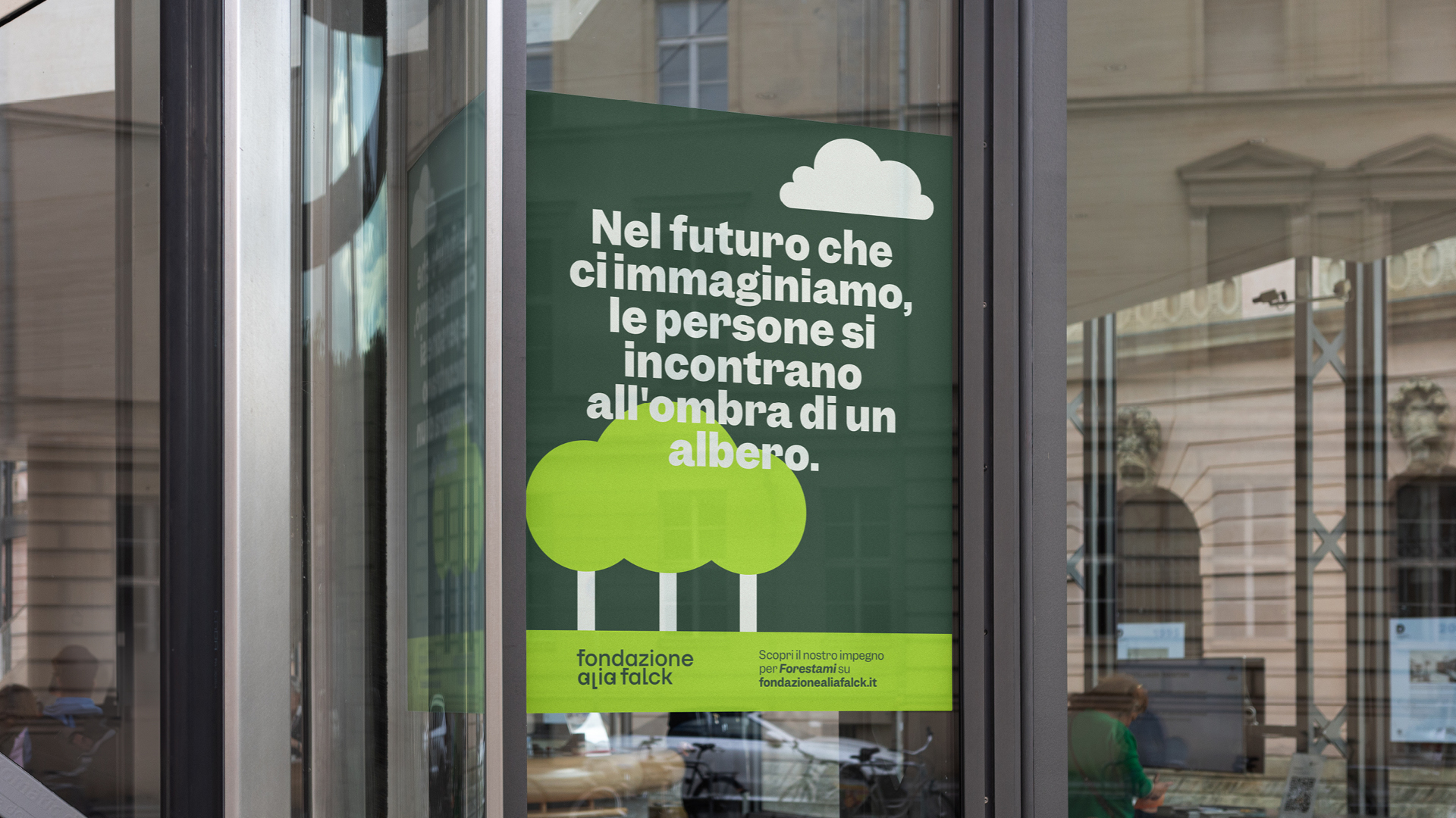
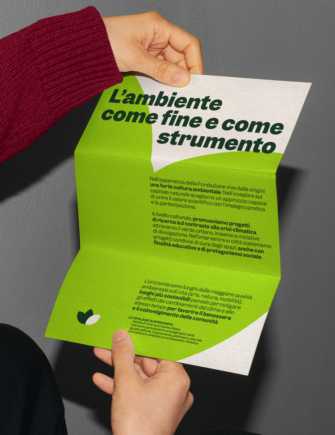
Fondazione Alia Falck brings, first and foremost to the Metropolitan City of Milan, a proactive approach to philanthropy that focuses on the social impact of its initiatives. The foundation supports beneficiary organizations not only with funding but also by providing expertise and connections. This partner‑style approach emphasizes curiosity, openness to innovation, and attentiveness — all of which were also poured into the logo design.
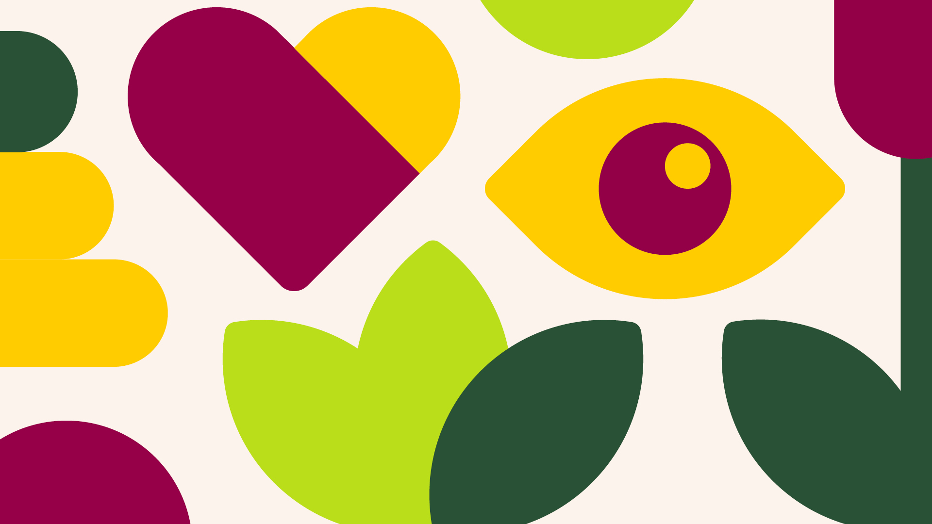
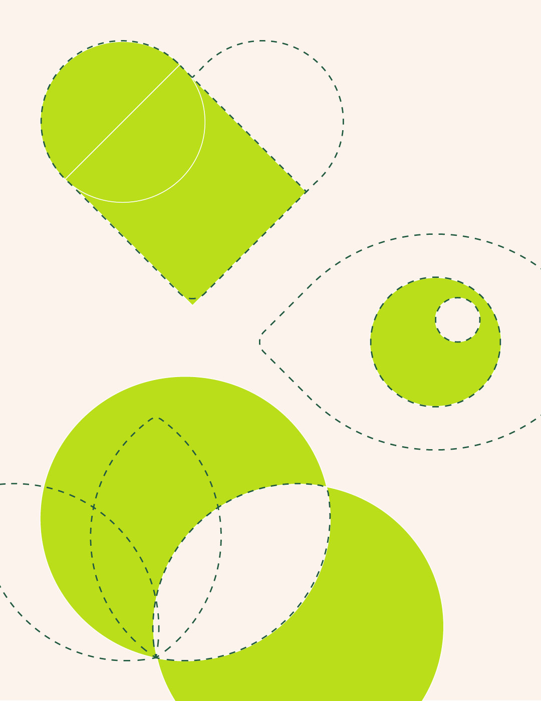
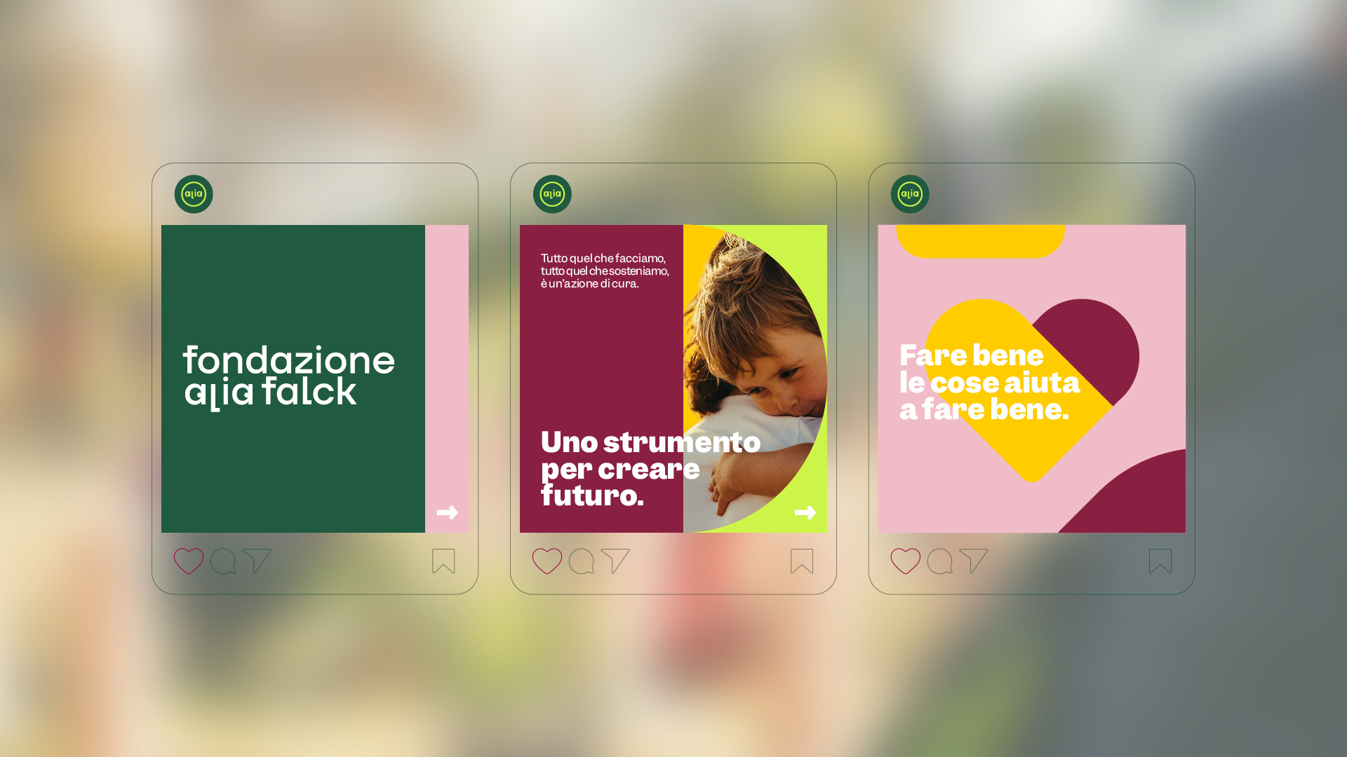
For an organization focused on the well-being of people and communities, the chosen approach is personification. Two pupils highlight the word Alia, bringing the logotype and circular symbol to life, all custom-designed. It’s an unconventional, clearly bold proposal within the landscape of foundations in Italy. The visual identity unfolds in a rich color universe, reflecting the wide variety of themes addressed by the organization.
The icon system was developed in an original way, starting from basic shapes. Three symbols represent the foundation’s areas of work: mental health, urban green spaces, and culture for social cohesion.
The studio also created the Fondazione Alia Falck website, from content strategy and copywriting to web design. Continuing with a strong sense of expression, the organization presents the challenges it tackles and the concrete actions it takes, using a voice and style that balance institutional decisiveness with a human, approachable tone.

YOU MAY ALSO LIKE
-
MaaS for Italy: activities and results at a glance. The white paper designed by Bellissimo for the Italian Government
MaaS for Italy is Italy’s first large-scale pilot of the Mobility as a Service model. Funded with €56.9 million, the program involved six major cities and seven territories, encouraging local (...)
Read -
New languages for evolving institutions. A conversation with Massimiliano Cipolletta, President of the Torino Chamber of Commerce
Nearly a year after the rebrand, Bellissimmo’s project for the Torino Chamber of Commerce has been rolled out consistently across the territory — an opportunity now to reflect on the value of (...)
Read -
Packaging on display. At the ADI Design Museum, the three Boxes for inspirational design created by Bellissimo for Bombay Sapphire
From March 4 to March 26, 2026, the ADI Design Museum in Milan hosts the exhibition Design di Filiera. La Filiera del Packaging, curated by Carlo Branzaglia and Wladimiro Bendandi and promoted by (...)
Read -
Why teach entrepreneurship: an interview with Giancarlo Rocchietti and Barbara Graffino from Enter Academy
It can’t really be labelled as a school, but it’s more than just a training program. Enter Academy is a non-profit foundation that aims to inspire the next generation of entrepreneurs. Supported (...)
Read