Risottincasa Pan
LABELING MATTERS
For a great product to be elevated, sometimes the best solution is to disappear. Bellissimo created a packaging line designed to showcase the artisanal quality of the recipes — and, in doing so, refresh the brand.
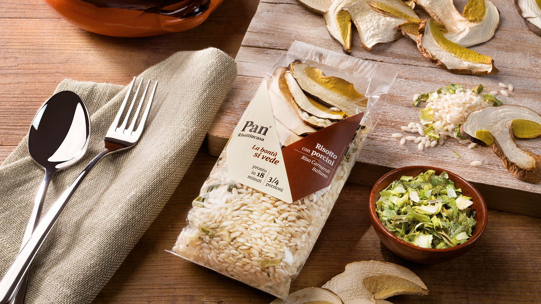
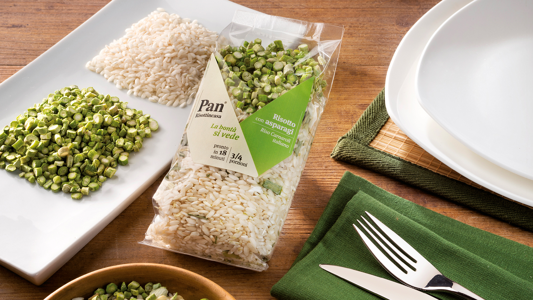
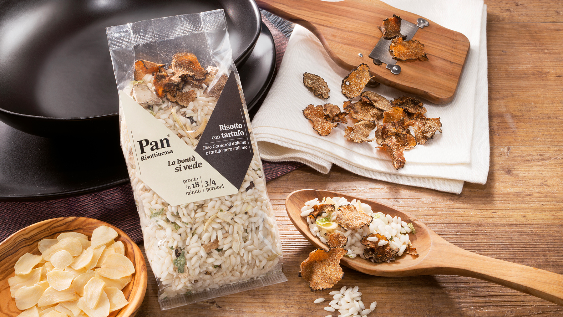
With Pan’s line of ready-to-eat risottos —an artisanal brand already known for its dried mushroom pouches— Bellissimo’s task is to “reveal” rather than explain, decorate, or embellish. The strength of these products lies in the natural quality and beauty of the ingredients — no powders or freeze-dried elements, unlike the recipes of industrial competitors.
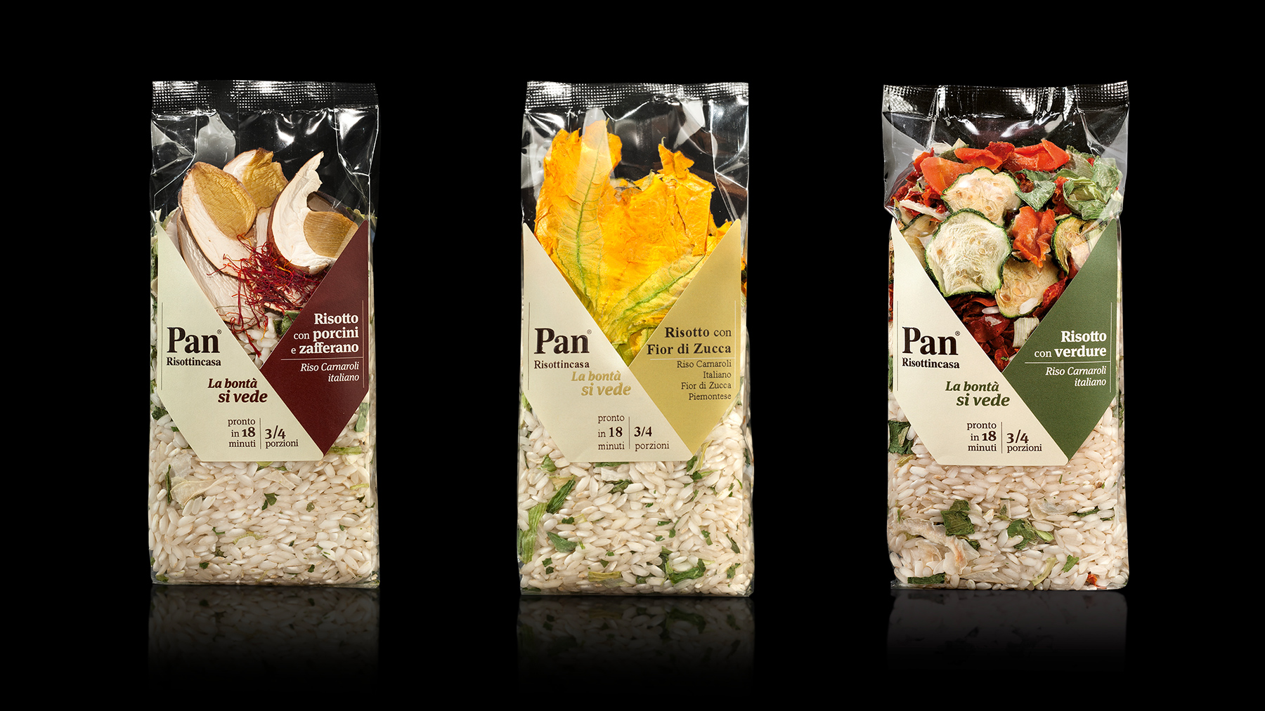
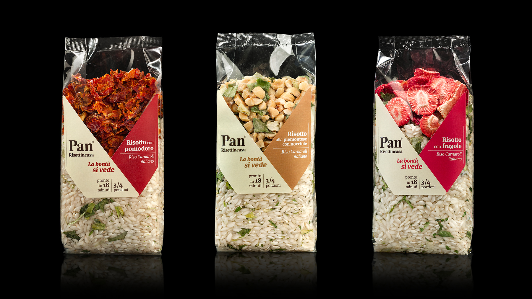
The solution is a V-shaped label, elegant and contemporary. The sticker wraps around the products, framing the top of these handmade risottos, highlighting the colors of the ingredients and showcasing their abundance. Given the originality of the approach, it’s a bold project in its own right — and it was later extended to other product lines including polenta.
Premium, budget-friendly. The label’s geometry is designed to optimize space on the printing sheet, just like a traditional shape — an approach that combines elegance with efficiency.
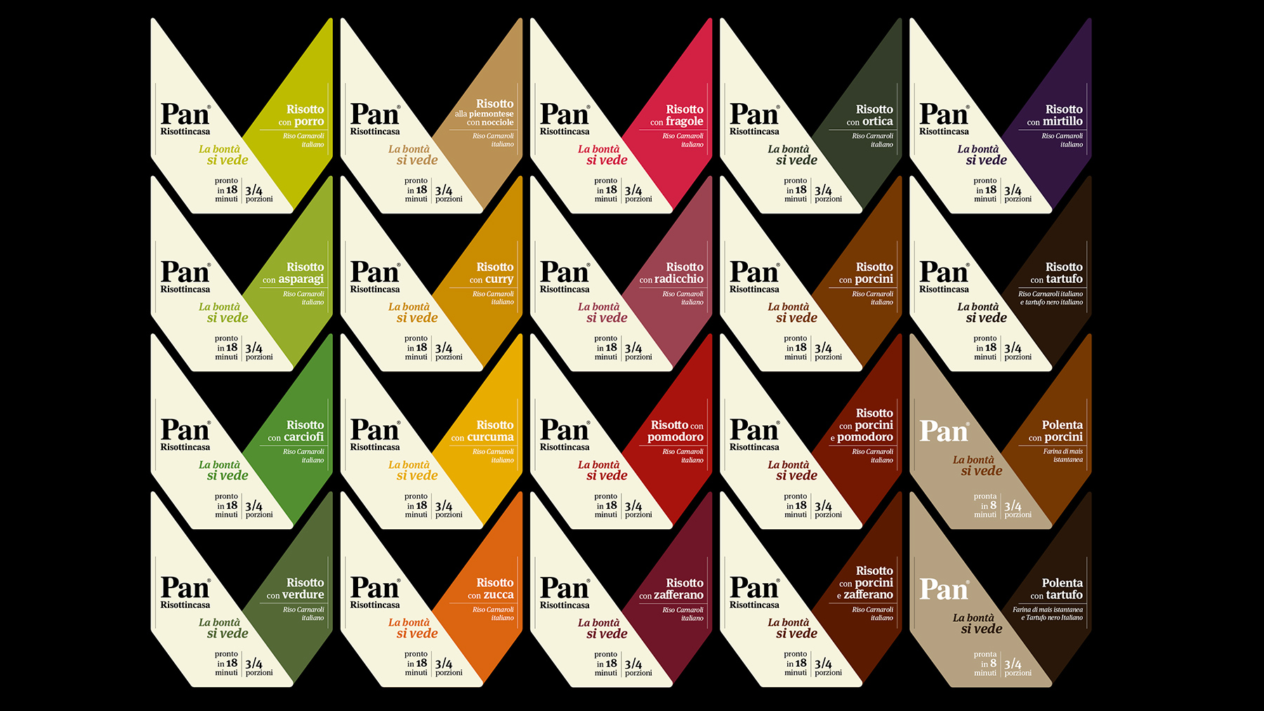
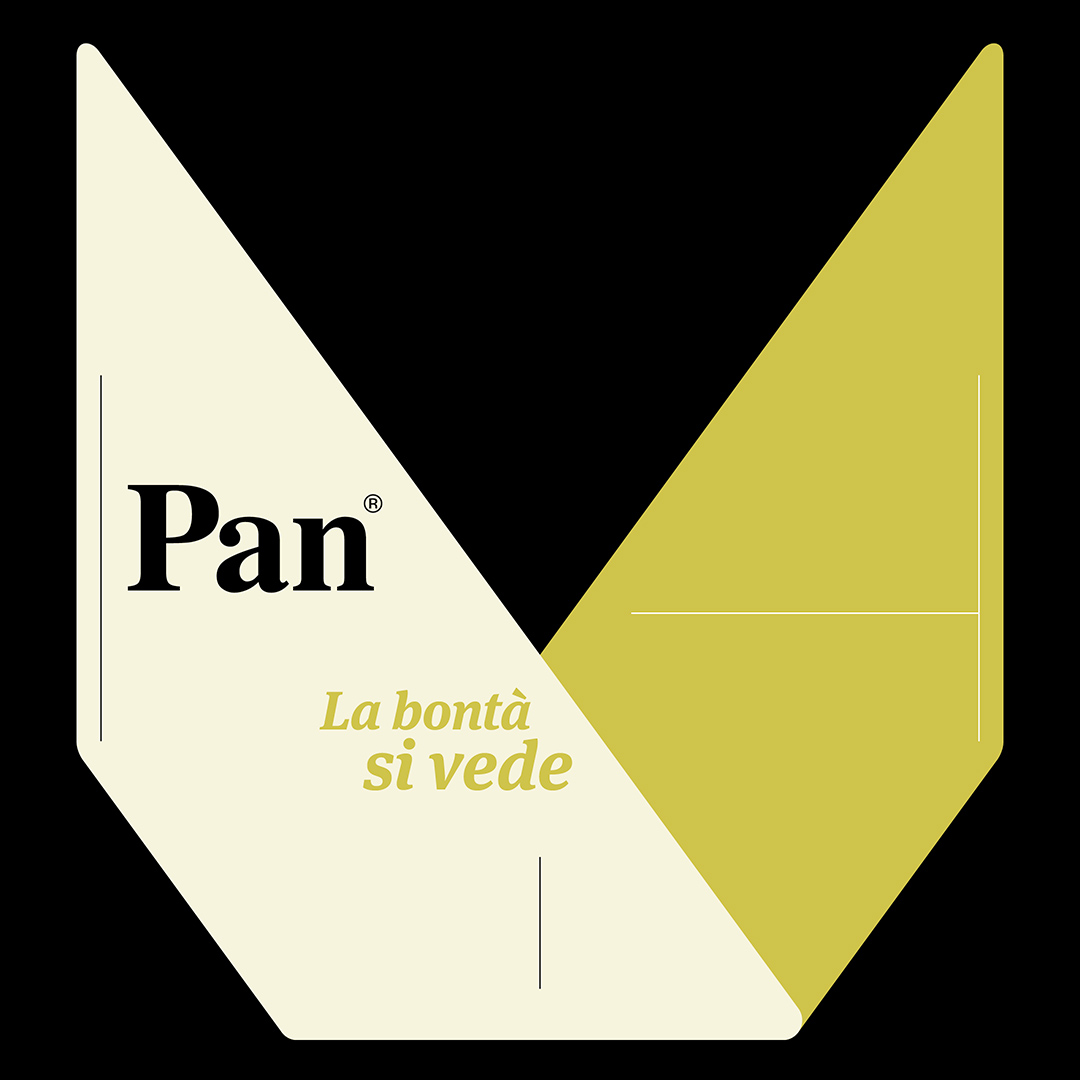

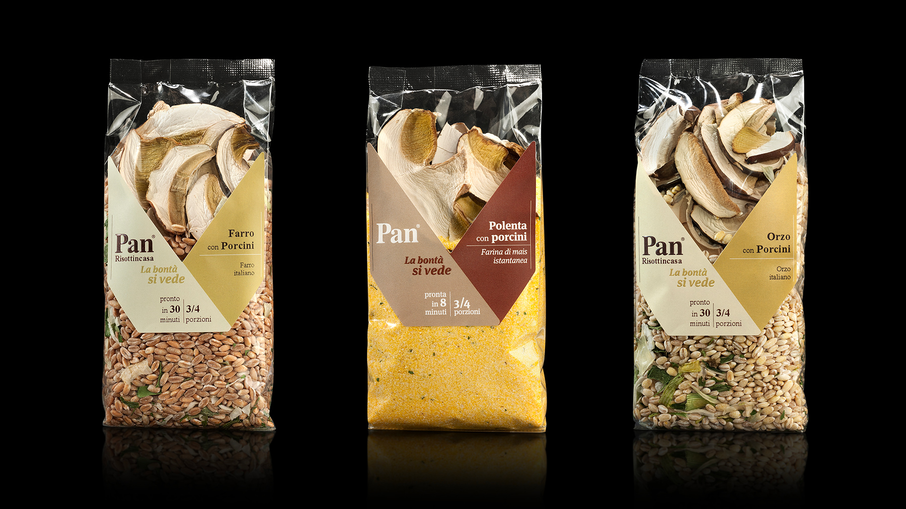
Bellissimo’s work puts the accent on the simple charm of a series of homemade recipes. From these same considerations came the range name, “Risottincasa” (Risottos-at-home), clear and commercially appealing, and the tagline introducing the products to the public: “La bontà si vede” (“Goodness You Can See”), which almost serves as the guiding principle for the entire packaging and communication project.

YOU MAY ALSO LIKE
-
Packaging on display. At the ADI Design Museum, the three Boxes for inspirational design created by Bellissimo for Bombay Sapphire
From March 4 to March 26, 2026, the ADI Design Museum in Milan hosts the exhibition Design di Filiera. La Filiera del Packaging, curated by Carlo Branzaglia and Wladimiro Bendandi and promoted by (...)
Read -
Why teach entrepreneurship: an interview with Giancarlo Rocchietti and Barbara Graffino from Enter Academy
It can’t really be labelled as a school, but it’s more than just a training program. Enter Academy is a non-profit foundation that aims to inspire the next generation of entrepreneurs. Supported (...)
Read -
Enter Academy makes its public debut. From naming to website, Bellissimo supports its launch event
It’s always exciting when a brand developed in the studio comes to life — especially when it does so in front of hundreds of people, at such a large and well-attended launch event.With the (...)
Read -
Lavazza Group: Bellissimo receives the Quality Award 2025
Photo: Andrea Guermani Every year, the companies collaborating with Lavazza Group come together for Supplier Coffee Links. The event is designed as a moment of exchange and collaboration across (...)
Read