Larry
Investing in branding
The investment company of the Falck family put brand communication front and center from day one — a rare example of design-driven thinking in the world of Italian family offices.

Family offices are companies created to manage the assets of one or more families efficiently, often following major sales or divestments. In this case, Larry is the name chosen by one branch of the Falck family for the investment firm they founded after selling Falck Renewables, the successor to the historic Falck Group.

Looking to position itself in the financial market with the strength of a well-crafted professional brand, the company turned to Bellissimo for a process that would shape both its identity and the communication strategy of the newly established family foundation, Fondazione Alia Falck. While the two organizations share the same origins and a strong set of values —captured in the branding content developed by the studio— their communication naturally diverges in purpose and visual style.
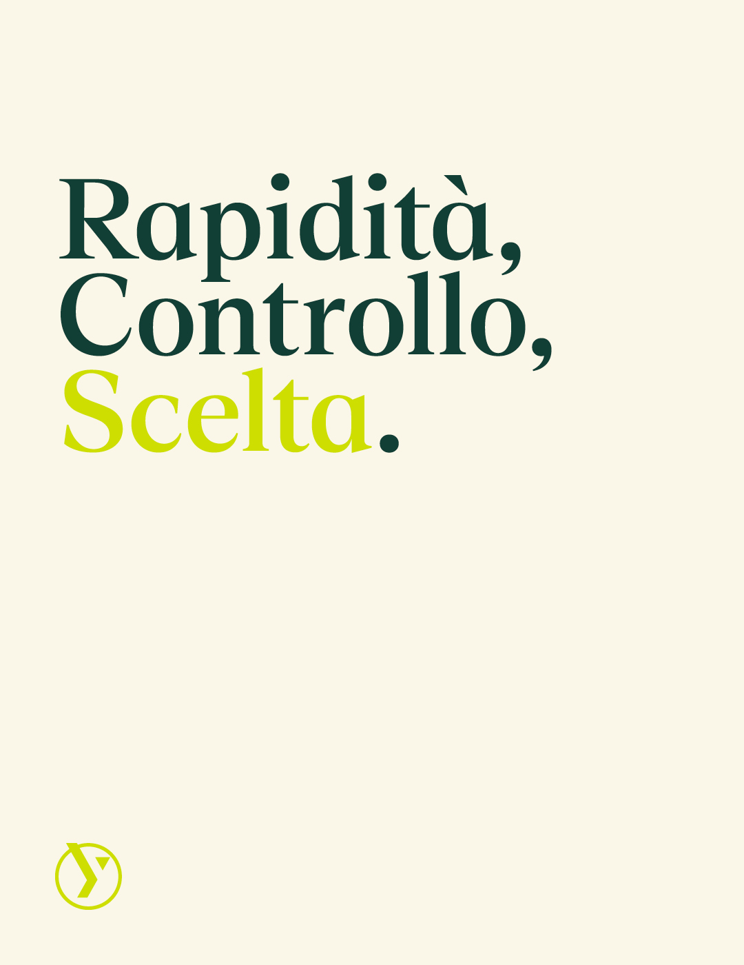


The visual identity is designed to convey stability and dynamism in equal parts. The y in Larry easily transforms into an arrow: the symbol becomes a compass pointing the way forward. The cuts and angled forms of the logo add a sense of motion across both printed materials and the website.
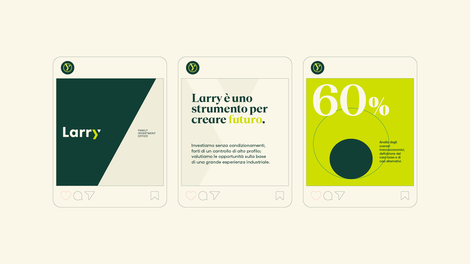
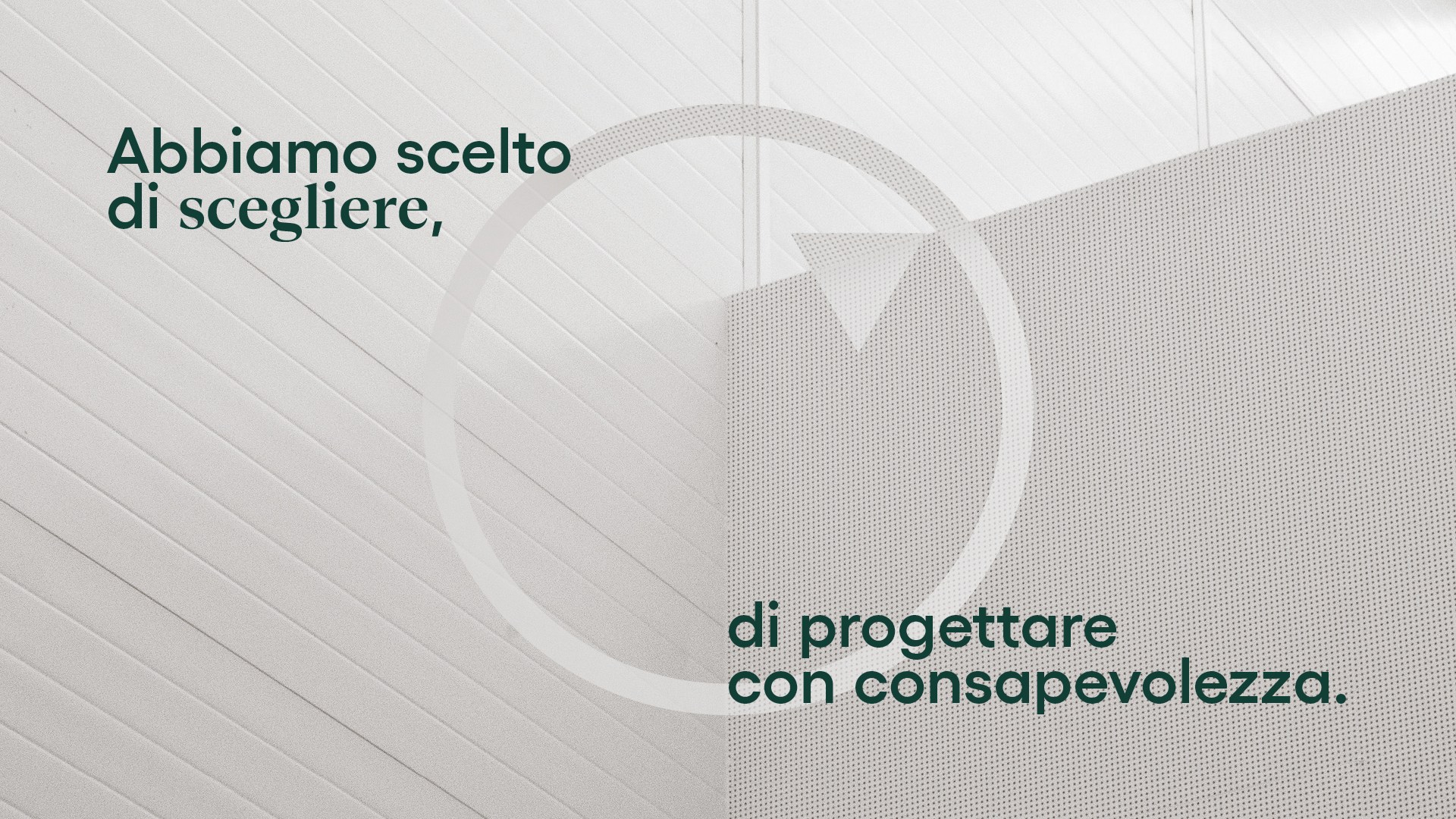
The project emphasizes the connection between making a choice — with a direction or an investment— and the future, a horizon to be reached with expertise and responsibility. At the same time, it maintains a link to the Falck Group’s industrial heritage, elegantly evoked through shades of green.


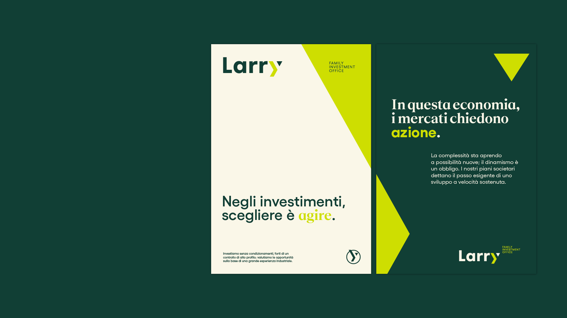
The visual identity is completed with a set of original finance-themed icons, designed based on the lines of the brand.

YOU MAY ALSO LIKE
-
Packaging on display. At the ADI Design Museum, the three Boxes for inspirational design created by Bellissimo for Bombay Sapphire
From March 4 to March 26, 2026, the ADI Design Museum in Milan hosts the exhibition Design di Filiera. La Filiera del Packaging, curated by Carlo Branzaglia and Wladimiro Bendandi and promoted by (...)
Read -
Why teach entrepreneurship: an interview with Giancarlo Rocchietti and Barbara Graffino from Enter Academy
It can’t really be labelled as a school, but it’s more than just a training program. Enter Academy is a non-profit foundation that aims to inspire the next generation of entrepreneurs. Supported (...)
Read -
Enter Academy makes its public debut. From naming to website, Bellissimo supports its launch event
It’s always exciting when a brand developed in the studio comes to life — especially when it does so in front of hundreds of people, at such a large and well-attended launch event.With the (...)
Read -
Lavazza Group: Bellissimo receives the Quality Award 2025
Photo: Andrea Guermani Every year, the companies collaborating with Lavazza Group come together for Supplier Coffee Links. The event is designed as a moment of exchange and collaboration across (...)
Read