Aladina
THE MOKA OF MAESTROS
Beyond packaging. Bellissimo draws on the visual culture of great Italian design to create the key visual for Lavazza’s moka designed by internationally renowned architect Cino Zucchi.
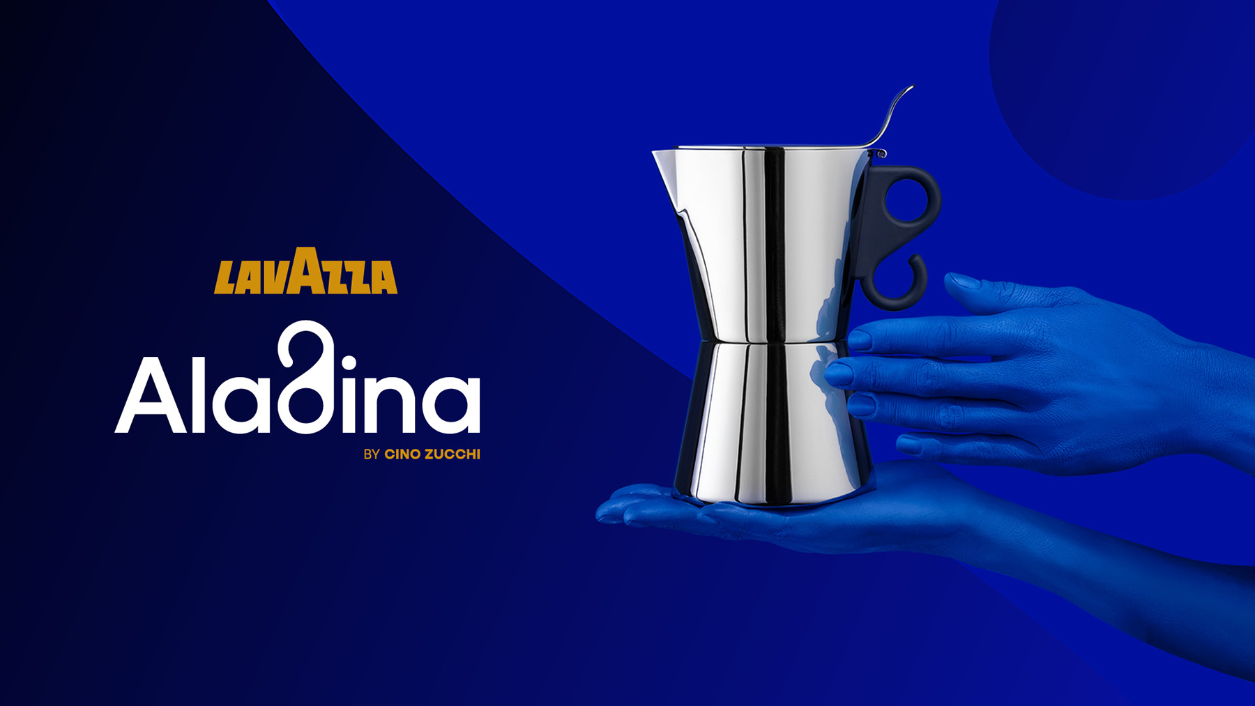
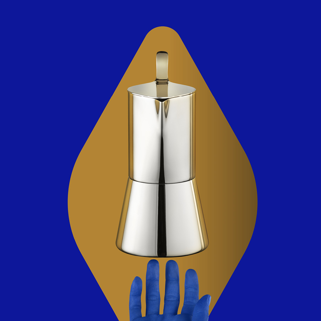
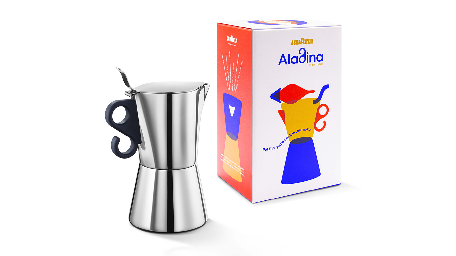
Bellissimo shapes the visual world around Aladina, the Lavazza moka designed by Cino Zucchi, who also created the brand’s Turin headquarters, the Nuvola. The moka’s design is based on the form of two stacked espresso cups —an idea that’s both simple and iconically strong— paired with a distinctive handle with soft, curved lines. Its name comes from the shape of the lid when viewed from above, which recalls the famous lamp, and connects to the trend set by Marco Zanuso’s Carmencita — another woman name with an exotic allure.


Bellissimo’s work has its natural starting point right here — with the product’s name and design. The graphics break down and reassemble the single elements of the moka: solid shapes and bold colors create a simple, appealing visual code, while the curves of the handle turn into the “d” in the lettering. The language draws from the visual world of 20th-century Italian design masters — above all, Bruno Munari and Massimo Vignelli.
To my eyes, it resonates strongly with a distinctly “Italian approach to graphic design,” seen in the history of Olivetti posters or memorable postwar advertisements. These works softened the “Swiss” rigor of simple forms and primary colors with clever collages and playful text.
Cino Zucchi, Architect and Designer


The reference of the launch campaign is clear: the magic of One Thousand and One Nights appears in the gestures of hands painted blue interacting with the moka. Here, desire is an everyday one: a good cup of coffee, and Aladina can make it come true over and over. To reflect the fairytale quality evoked by the name, Bellissimo completes the story with a series of short rhyming compositions that explore the senses and their connection to moka coffee, using a dreamy, nursery-rhyme–like language.


But you did all of this without a hint of nostalgia, instead embodying the values of a contemporary sensibility that embraces both ancient history and a constantly evolving material culture. And, not surprisingly, the logo is bellissimo!
Cino Zucchi, Architect and Designer

YOU MAY ALSO LIKE
-
Packaging on display. At the ADI Design Museum, the three Boxes for inspirational design created by Bellissimo for Bombay Sapphire
From March 4 to March 26, 2026, the ADI Design Museum in Milan hosts the exhibition Design di Filiera. La Filiera del Packaging, curated by Carlo Branzaglia and Wladimiro Bendandi and promoted by (...)
Read -
Why teach entrepreneurship: an interview with Giancarlo Rocchietti and Barbara Graffino from Enter Academy
It can’t really be labelled as a school, but it’s more than just a training program. Enter Academy is a non-profit foundation that aims to inspire the next generation of entrepreneurs. Supported (...)
Read -
Enter Academy makes its public debut. From naming to website, Bellissimo supports its launch event
It’s always exciting when a brand developed in the studio comes to life — especially when it does so in front of hundreds of people, at such a large and well-attended launch event.With the (...)
Read -
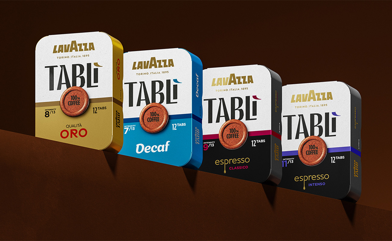
Lavazza Group: Bellissimo receives the Quality Award 2025
Photo: Andrea Guermani Every year, the companies collaborating with Lavazza Group come together for Supplier Coffee Links. The event is designed as a moment of exchange and collaboration across (...)
Read