INTERVIEWS
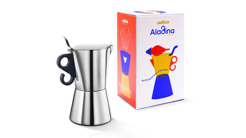
A coffee (from the moka) with Cino Zucchi
The best way to present the project for Lavazza’s new moka, exotically named Aladina, is to ask its designer, Cino Zucchi — the Milanese architect recognized internationally, who had already collaborated with the company on a very different scale for the Turin headquarters, the renowned Nuvola. We thank him again for his thoughtful answers.
What does it mean to design an object so central to Italian culture and visual imagination?
The coffee maker is an everyday object that should form the beloved backdrop of our lives. The shape of Aladina aims to achieve the obvious, undeniable character of Vermeer’s painted jug in The Milkmaid, while also containing the “genetic code” of Lavazza icons: Caballero and Carmencita, or the classic cups with their distinctive round handles.
From the city to the moka: are there traces of your architectural work in Aladina’s design?
I don’t believe in direct formal transfers between design and architecture: the famous saying “from spoon to city” shouldn’t make us design cities shaped like spoons or spoons shaped like cities. Lavazza’s headquarters in Via Bologna and Aladina might share a unity of character: something that balances formal recognizability with an openness to everyday life. For me, form doesn’t “follow” function; it embraces it, cradles it, nurtures it, and lets its harmonic overtones resonate.
What’s your relationship with coffee? Did it influence the project?
I’m not sure a fetishist would make the best designer of high heels, or a cocaine addict the best designer of silver coffee spoons — but certainly a “caffeine addict” like me had to design a coffee maker that could live with me comfortably for long hours of the day and night.
Why Aladina? How did this Middle Eastern aura originate?
The form of Aladina evolved from stacking two Lavazza cups. From the start, the lid’s eye-shaped profile suggested a resemblance to Aladdin’s lamp. Marco Zanuso had named his coffee maker “Carmencita,” and we thought it would be nice to continue the series with a slightly exotic female name — in this case, resulting from a kind of “gender swap.”
Our project creates a visual world based on the coffee maker’s forms — a sort of graphic translation of the design. What’s your take on this? What value does it add?
From the very first proposal, your graphic and communication project thrilled me. I think it really resonates with the design itself. To my eyes, it carries echoes of a uniquely “Italian approach to graphics,” seen in Olivetti posters or memorable postwar advertising, which soften the Swiss-like rigor of simple forms and primary colors with clever collages and playful text. But you’ve done all this without nostalgia, embodying a contemporary sensibility that embraces both ancient and recent history, within a constantly evolving material culture. And, not least, the logo is beautiful!
Published: Dec 19, 2023
YOU MAY ALSO LIKE
-
Packaging on display. At the ADI Design Museum, the three Boxes for inspirational design created by Bellissimo for Bombay Sapphire
From March 4 to March 26, 2026, the ADI Design Museum in Milan hosts the exhibition Design di Filiera. La Filiera del Packaging, curated by Carlo Branzaglia and Wladimiro Bendandi and promoted by (...)
Read -
Why teach entrepreneurship: an interview with Giancarlo Rocchietti and Barbara Graffino from Enter Academy
It can’t really be labelled as a school, but it’s more than just a training program. Enter Academy is a non-profit foundation that aims to inspire the next generation of entrepreneurs. Supported (...)
Read -
Enter Academy makes its public debut. From naming to website, Bellissimo supports its launch event
It’s always exciting when a brand developed in the studio comes to life — especially when it does so in front of hundreds of people, at such a large and well-attended launch event.With the (...)
Read -
Lavazza Group: Bellissimo receives the Quality Award 2025
Photo: Andrea Guermani Every year, the companies collaborating with Lavazza Group come together for Supplier Coffee Links. The event is designed as a moment of exchange and collaboration across (...)
Read