Giobert
Le parole chiave
An industrial company takes the opportunity of its 60th anniversary to tell its story and refresh its image — a story of opening up to the international market.

The project for Giobert serves as a prime example of Bellissimo’s work in support of mid-sized industrial companies. A manufacturer of key kits and other automotive components, the company has undergone a deep technical development and internationalization process since the 2000s — a transformation that was not reflected in its communications, still tied to outdated images and tools. This scenario created the need for a full rebranding.

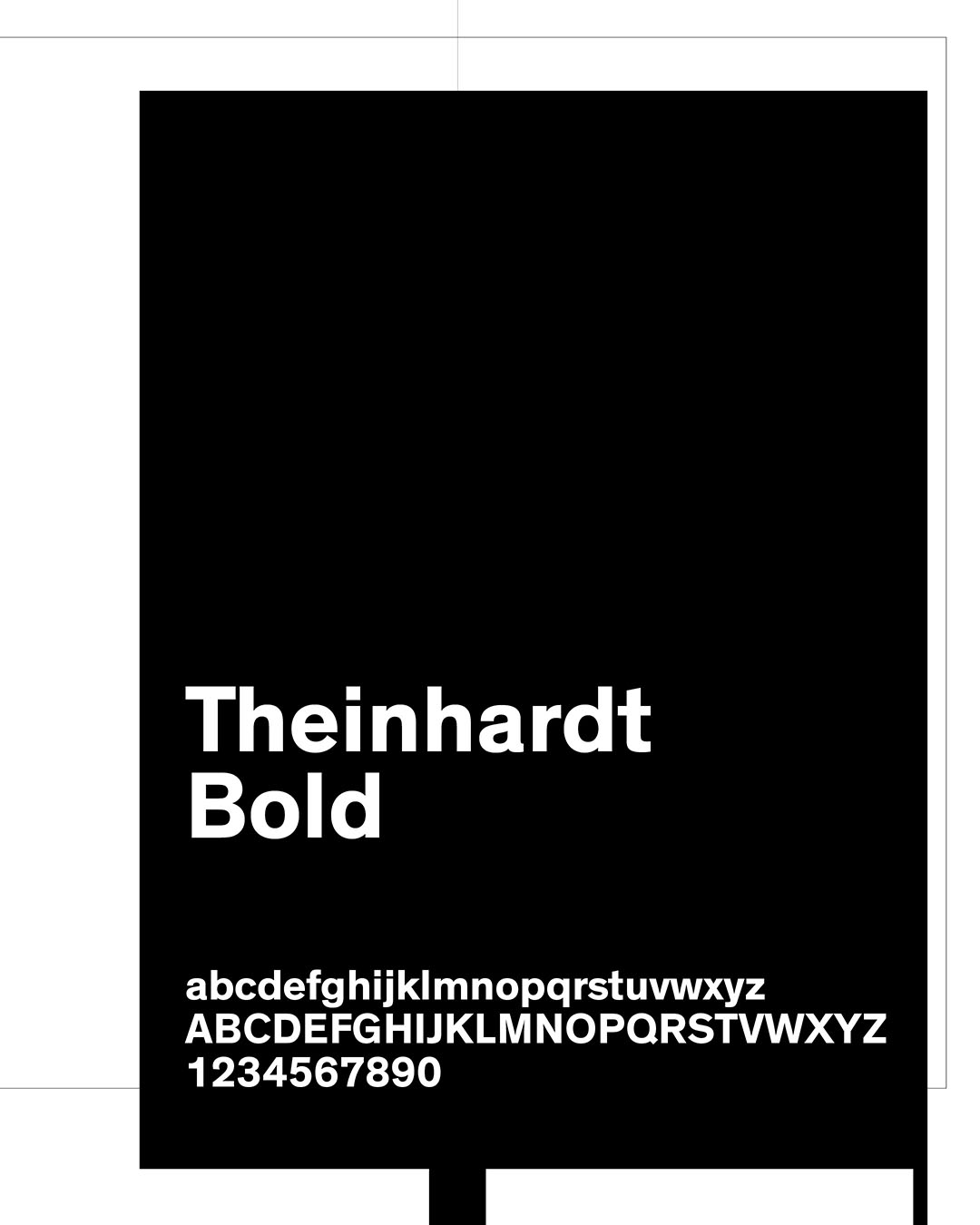
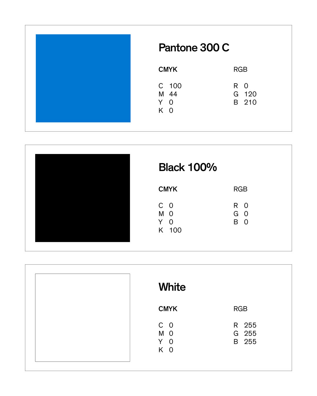
The revamping follows the method developed by Bellissimo: starting with interviews and moving on to the definition of the Brand Constellation™ and Stella Polare™, highlighting the role of production flexibility and precision in comparison with multinational competitors, and then moving on to a graphic design project based on these strategic guidelines. The new logo is a restyling of the historic symbol.
Sixty years, to be exact: the project proved to be a powerful moment of shared pride within the company.
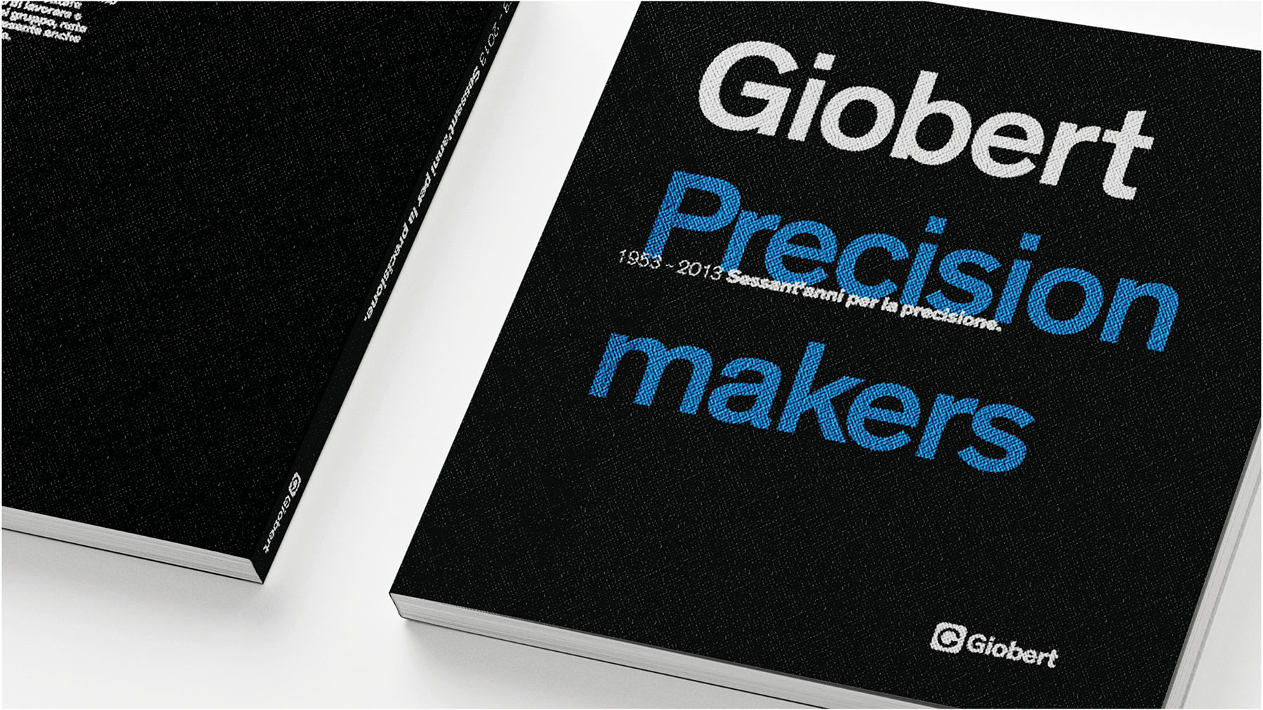
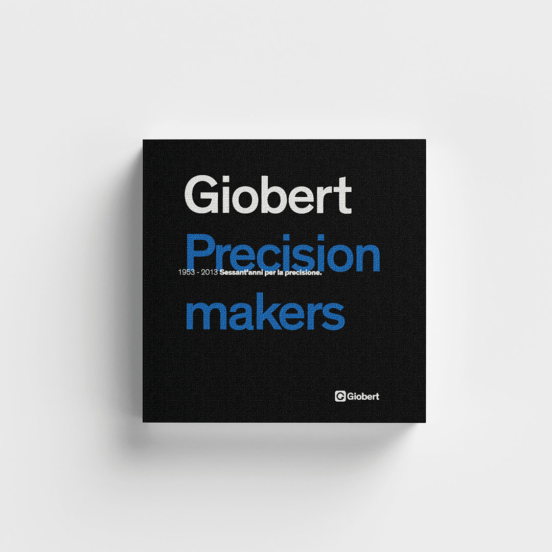
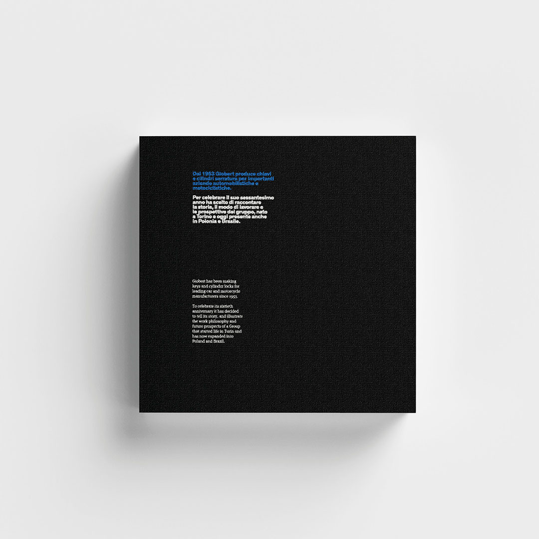
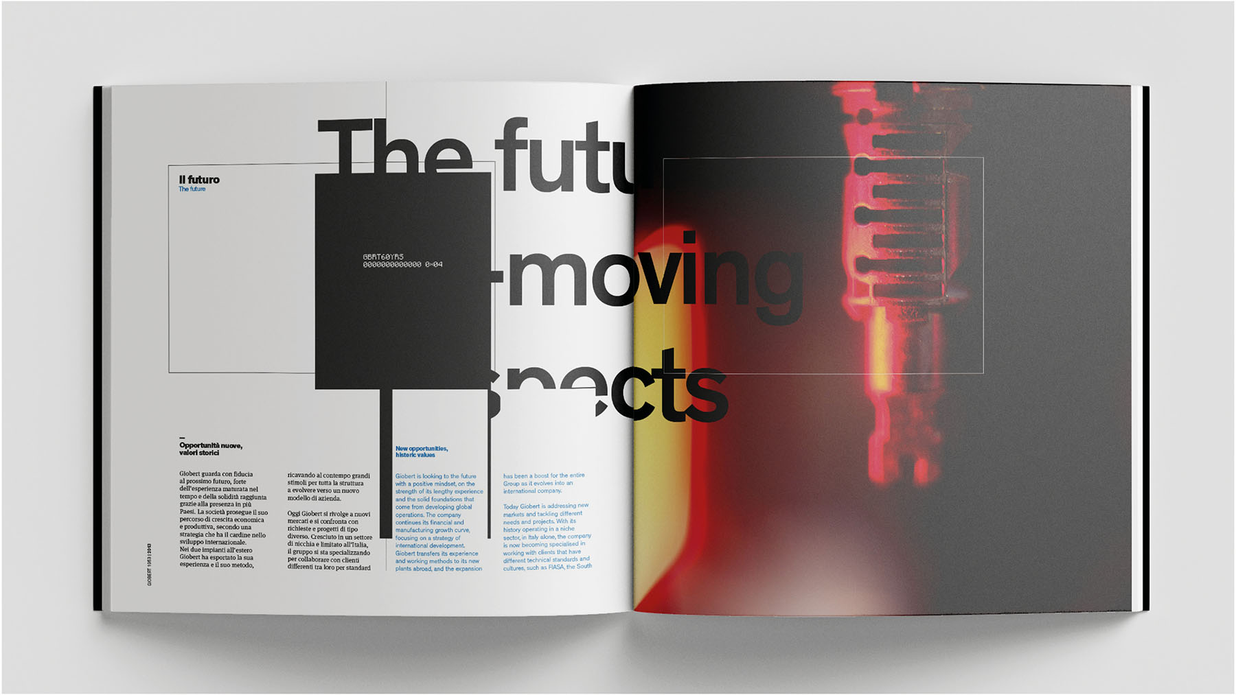
The collaboration with Giobert took place ahead of a historic company anniversary. Founded in a small workshop in Turin sixty years earlier, in 1953, the company’s current president, Paolo Bertolino, wanted to pay tribute to his family’s industrial history through a publication. Not a nostalgic book or a collection of memories, but a work designed to trace the trajectory of the industry through innovations and new products, entrepreneurial decisions, and rigorous quality control. It was also the perfect opportunity to showcase the brand values that had just been defined.
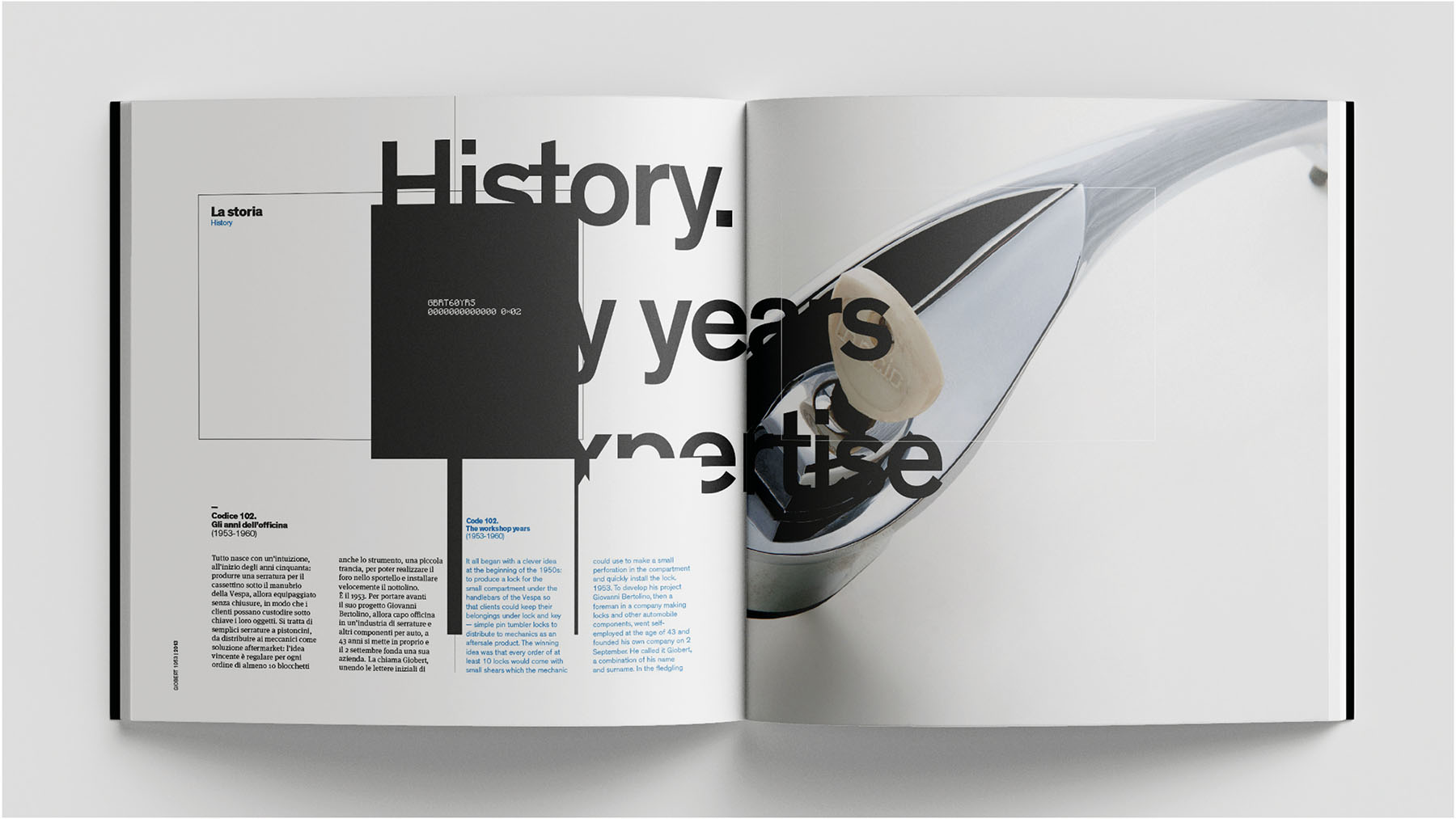
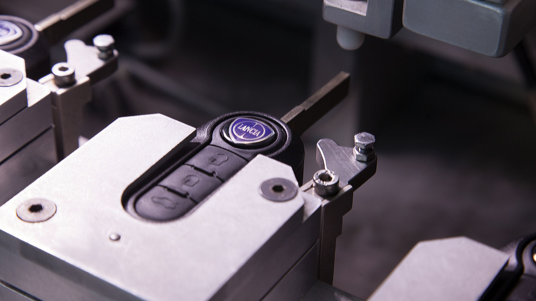
Car keys: an everyday object, a familiar gesture. The book also manages to convey the everyday, relatable side of these products.
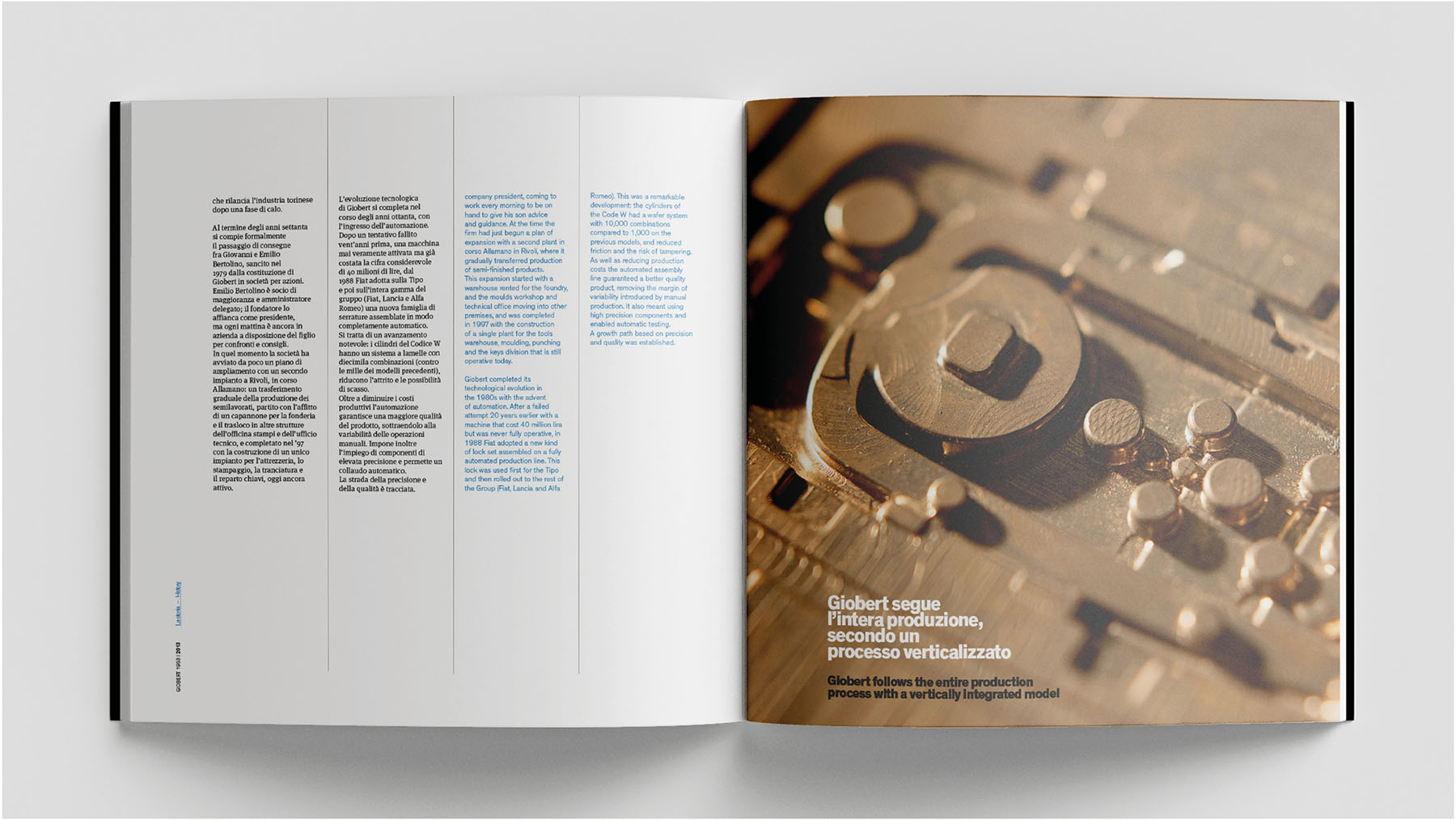
Bellissimo oversaw the editorial project and content development, starting with a series of interviews with the company’s long-standing figures. Years later, the book is still appreciated not only for the quality of its narrative but also for its graphic design and bold solutions — a reflection of both the creative freedom granted by the client and a distinctively contemporary sensibility.
Working with Bellissimo was very stimulating — a chance to reflect on your own company while engaging with a different world. But above all, it was an opportunity to meet talented people I immediately found great harmony with.
Paolo Bertolino, President and CEO
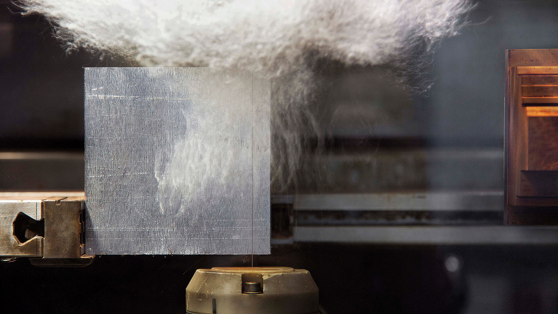
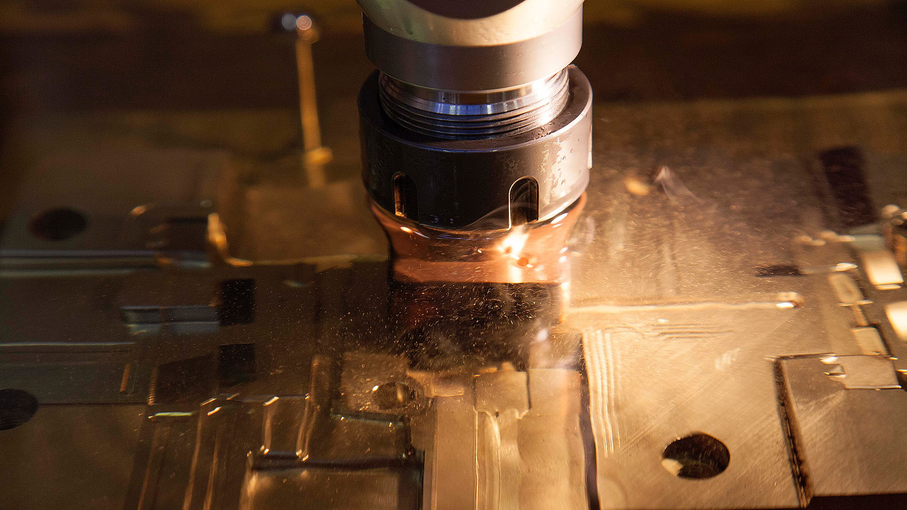
Photographic language plays a crucial role in the project and in all of Giobert’s communications. The images reveal the tangible beauty of a technical world.


YOU MAY ALSO LIKE
-
AlpTextyles, the EU Cohesion Policy project, is shortlisted for the 2026 RegioStars Awards, promoted by the European Commission
Beautiful news for AlpTextyles – Intertwining Cultures. The Interreg Alpine Space project, for which we served as communication partner from 2023 to 2025, has been selected as one of the 25 (...)
Read -
MaaS for Italy: activities and results at a glance. The white paper designed by Bellissimo for the Italian Government
MaaS for Italy is Italy’s first large-scale pilot of the Mobility as a Service model. Funded with €56.9 million, the program involved six major cities and seven territories, encouraging local (...)
Read -
New languages for evolving institutions. A conversation with Massimiliano Cipolletta, President of the Torino Chamber of Commerce
Nearly a year after the rebrand, Bellissimmo’s project for the Torino Chamber of Commerce has been rolled out consistently across the territory — an opportunity now to reflect on the value of (...)
Read -
Packaging on display. At the ADI Design Museum, the three Boxes for inspirational design created by Bellissimo for Bombay Sapphire
From March 4 to March 26, 2026, the ADI Design Museum in Milan hosts the exhibition Design di Filiera. La Filiera del Packaging, curated by Carlo Branzaglia and Wladimiro Bendandi and promoted by (...)
Read