Torino Chamber of Commerce
Open chamber
Bellissimo refreshes the image of the historic institution. The visual identity aims to convey the dynamism of the local ecosystem. Everything begins with the logo design.
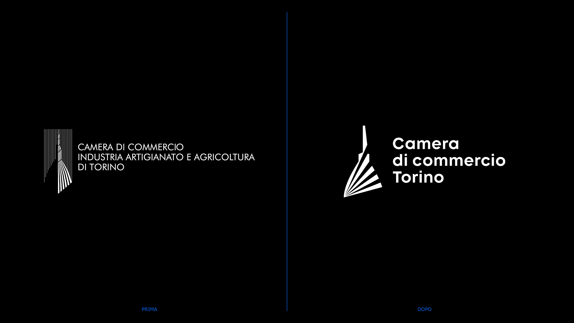
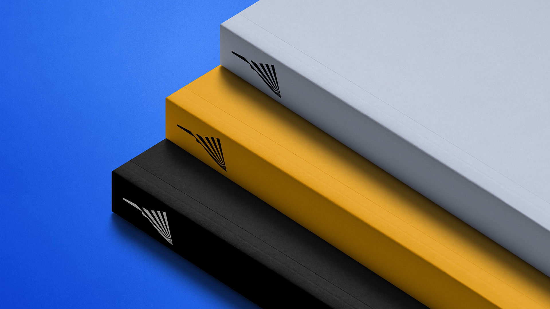
Working on a symbol recognized by everyone is perhaps the ultimate challenge for a designer. For over thirty years, the former logo of the Torino Chamber of Commerce had been a shared reference across the entire region — for entrepreneurs, business owners, retailers, professionals, and above all, for citizens. The emblem depicted the Mole Antonelliana, stylized through a series of vertical lines. The Chamber’s brief was to retain this subject —the city’s iconic symbol— while reinterpreting it in a contemporary way: an identity-defining mark capable of conveying vitality and opening up to future evolutions.
The new form emerges from a careful deconstruction of the Mole’s essential elements, then recomposed according to balanced proportions.
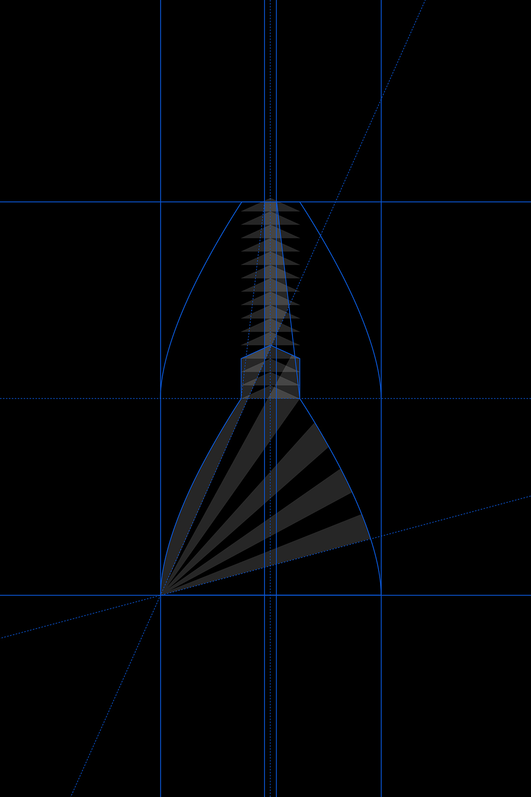

In Bellissimo’s redesign, the vertical lines of the historic logo adopt a new conceptual perspective. A bundle of diagonal lines fans outward, lending lightness and motion to the symbol — a gesture of openness and momentum, tending toward future growth. The lines radiate from the Mole, symbolizing the multiple areas of action of an institution that serves as a driver of development: enterprise, innovation, culture, territory… The result is a “pointed” mark, asymmetrical yet harmonious, instantly recognizable and fully functional at any scale, from letterhead to large exhibition banners.
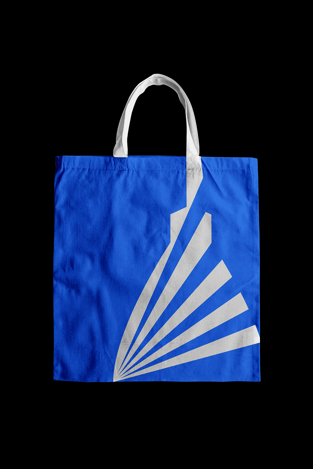
The logo is only the starting point. The fan-shaped bands form the foundation of a broader visual system. They generate graphic layouts, patterns, and motifs applied across a wide range of content and touch-points: reports, social posts, infographics, installations. In this way, they embody the idea of an “open” Chamber — an institution that safeguards its past while projecting it into a new network of relationships and initiatives.
Geometric and highly readable, the typeface interacts with the lines of the symbol, creating a coherent and versatile system.


Typography received special attention. Reflecting the client’s desire to convey a sense of approachability and warmth through the visual identity, the logo shifts from uppercase to lowercase, creating a friendlier, more personal feel. Certain letters were subtly customized with diagonal cuts that echo the angle of the symbol, ensuring a cohesive and harmonious visual language.

Alongside the institutional elegance of black and white, the palette reinterprets yellow and blue, the colors rooted in the visual tradition of the City of Turin. Two accent tones —ice gray and dark brown— enrich the palette, introducing a cooler and a warmer note, respectively, to complement the two primary colors. Within this refined range emerges a language that is sober yet contemporary, combining institutional rigor with aesthetic sensitivity.
Unveiled in February 2025 and rolled out beginning in the summer, the new logo of the Torino Chamber of Commerce has been received as a symbol of both continuity and renewal. The recognizability of the Mole preserves memory, while the new geometry introduces a sense of openness, movement, and forward-looking energy. Like the city it represents, the Chamber’s visual identity evolves — from a static icon to a living, dynamic symbol capable of expressing a changing Turin and continuing to build bridges between business, culture, and the community.


YOU MAY ALSO LIKE
-
Packaging on display. At the ADI Design Museum, the three Boxes for inspirational design created by Bellissimo for Bombay Sapphire
From March 4 to March 26, 2026, the ADI Design Museum in Milan hosts the exhibition Design di Filiera. La Filiera del Packaging, curated by Carlo Branzaglia and Wladimiro Bendandi and promoted by (...)
Read -
Why teach entrepreneurship: an interview with Giancarlo Rocchietti and Barbara Graffino from Enter Academy
It can’t really be labelled as a school, but it’s more than just a training program. Enter Academy is a non-profit foundation that aims to inspire the next generation of entrepreneurs. Supported (...)
Read -
Enter Academy makes its public debut. From naming to website, Bellissimo supports its launch event
It’s always exciting when a brand developed in the studio comes to life — especially when it does so in front of hundreds of people, at such a large and well-attended launch event.With the (...)
Read -
Lavazza Group: Bellissimo receives the Quality Award 2025
Photo: Andrea Guermani Every year, the companies collaborating with Lavazza Group come together for Supplier Coffee Links. The event is designed as a moment of exchange and collaboration across (...)
Read