Grappa Libarna
DESIGNED BY THE LETTER
Gruppo Montenegro chooses to relaunch a historic grappa brand. Bellissimo develops the packaging for the wine shop circuit, giving the brand a refreshed visual identity.
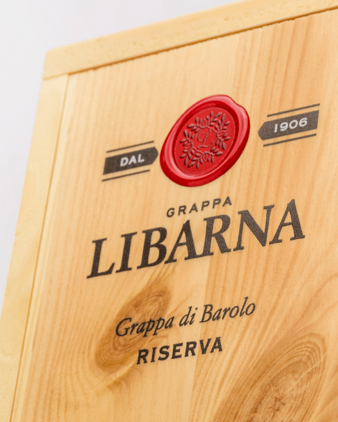
Grappa Libarna, a label rooted in Piedmontese tradition, is a distillate closely tied to its place of origin. Its name comes from the Roman settlement on the banks of the Scrivia River, called Libarna, in what is now the province of Alessandria. In 2021, Gruppo Montenegro, the third-largest Italian company in the spirits sector, relaunched the brand as part of its “I liquori della tradizione italiana” range, entrusting Bellissimo with the project — one of several collaborations between the studio and the renowned brand of amaro “with an authentic taste.”
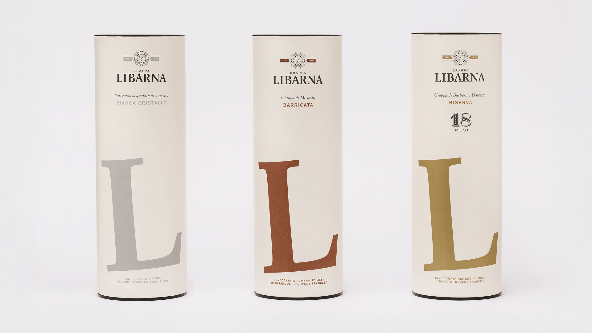
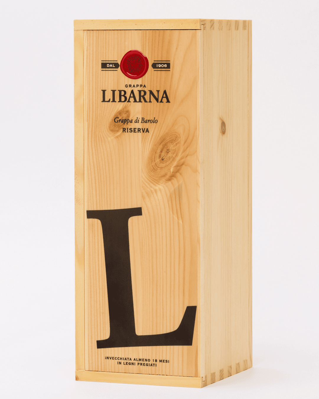
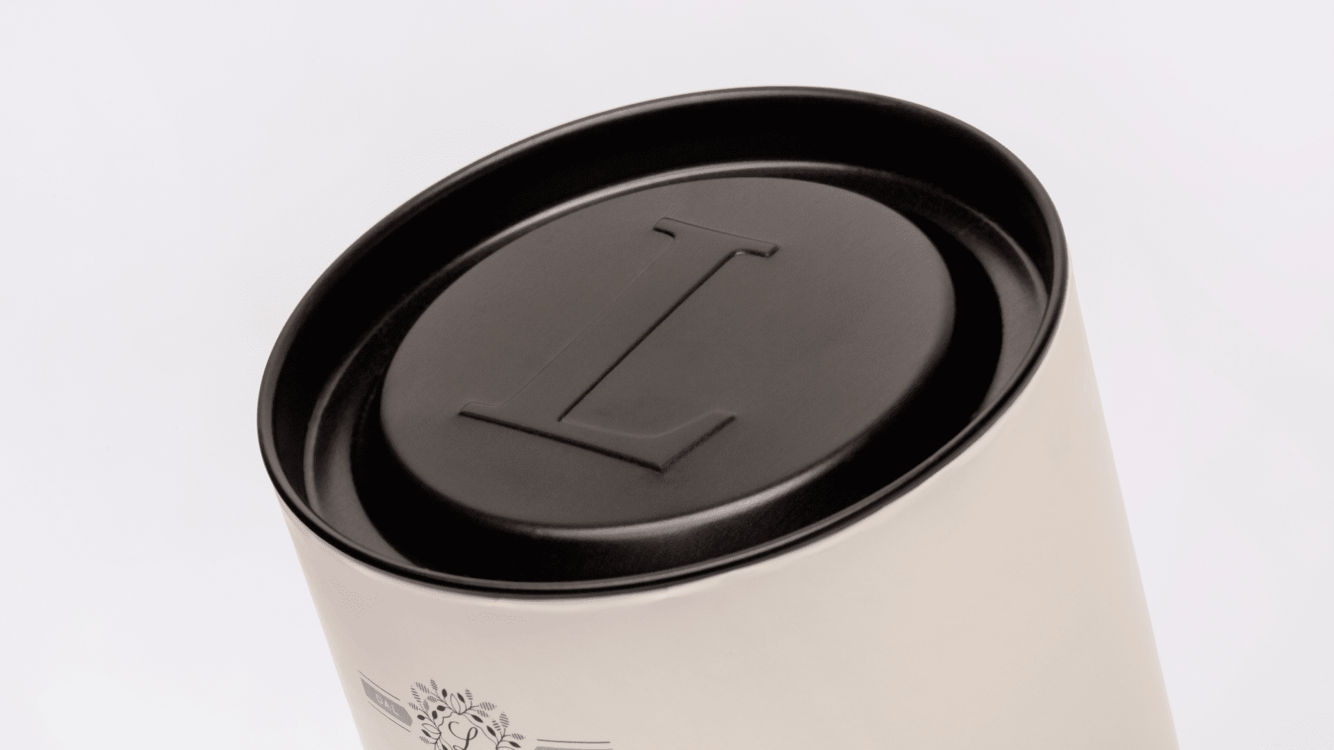
Bellissimo created the new packaging to present the grappa to the discerning clientele of wine shops and specialty retailers. The lettering of “L” in Libarna becomes the brand’s graphic symbol, designed to stand out on the shelves and appeal to grappa enthusiasts with a fresh new look — also thanks to the slight diagonal tilt of the letter.
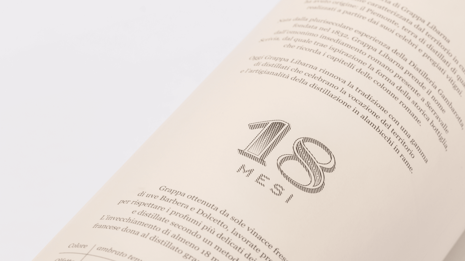
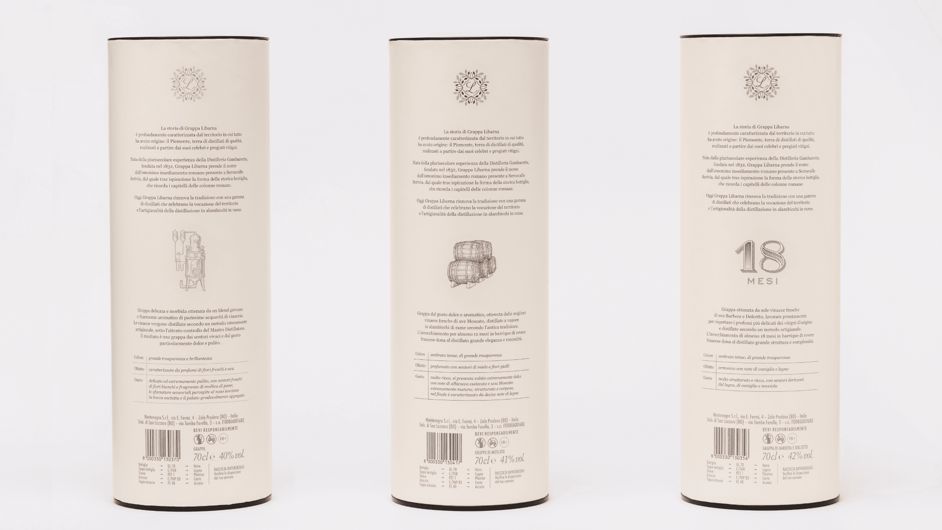
The result is an essential “cover,” minimal in its historic character, with strong impact and shelf visibility. The Libarna range includes four varieties of grappa, each with its own distinctive color, consistent and aligned with the labels on the precious bottles. The color palette follows strategic research on competitors: gray for Cristallo, brick for Barricata, ochre for the 18 Months, and black for the Barolo Riserva. The latter also stands out for its wooden container, a nod to the prized barrels in which it is aged.
With its work on the packaging, Bellissimo effectively provides Grappa Libarna with its new graphic style elements for communication. And once again, it demonstrates the role of typography in shaping brand identity.

YOU MAY ALSO LIKE
-
Packaging on display. At the ADI Design Museum, the three Boxes for inspirational design created by Bellissimo for Bombay Sapphire
From March 4 to March 26, 2026, the ADI Design Museum in Milan hosts the exhibition Design di Filiera. La Filiera del Packaging, curated by Carlo Branzaglia and Wladimiro Bendandi and promoted by (...)
Read -
Why teach entrepreneurship: an interview with Giancarlo Rocchietti and Barbara Graffino from Enter Academy
It can’t really be labelled as a school, but it’s more than just a training program. Enter Academy is a non-profit foundation that aims to inspire the next generation of entrepreneurs. Supported (...)
Read -
Enter Academy makes its public debut. From naming to website, Bellissimo supports its launch event
It’s always exciting when a brand developed in the studio comes to life — especially when it does so in front of hundreds of people, at such a large and well-attended launch event.With the (...)
Read -
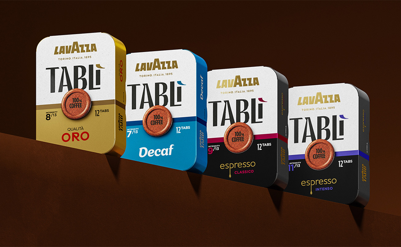
Lavazza Group: Bellissimo receives the Quality Award 2025
Photo: Andrea Guermani Every year, the companies collaborating with Lavazza Group come together for Supplier Coffee Links. The event is designed as a moment of exchange and collaboration across (...)
Read